Saad Khurshid Index of worksGraphic Design and Illustration
Helsinki, FI |
|
|
Send an Email
Follow on Instagram
|
Saad Khurshid Index of worksGraphic Design and Illustration
Helsinki, FI |
|
|
Send an Email
Follow on Instagram
|
|
Work
Client
Date
Medium
Dimension
Category
|
|
|
Self-initiated
2021
Opentype
1000upm
Typeface
|
|
|
Self-initiated
2021
Staple-bound, 16p
210 × 148 mm
Book Concept
|
|
|
Raco
2021
Art direction
—
Branding
|
|
|
Sohail Abdullah
2020
Stationery
—
Branding
|
|
|
Sohail Abdullah
2020
Modular typeface
—
Typeface
|
|
|
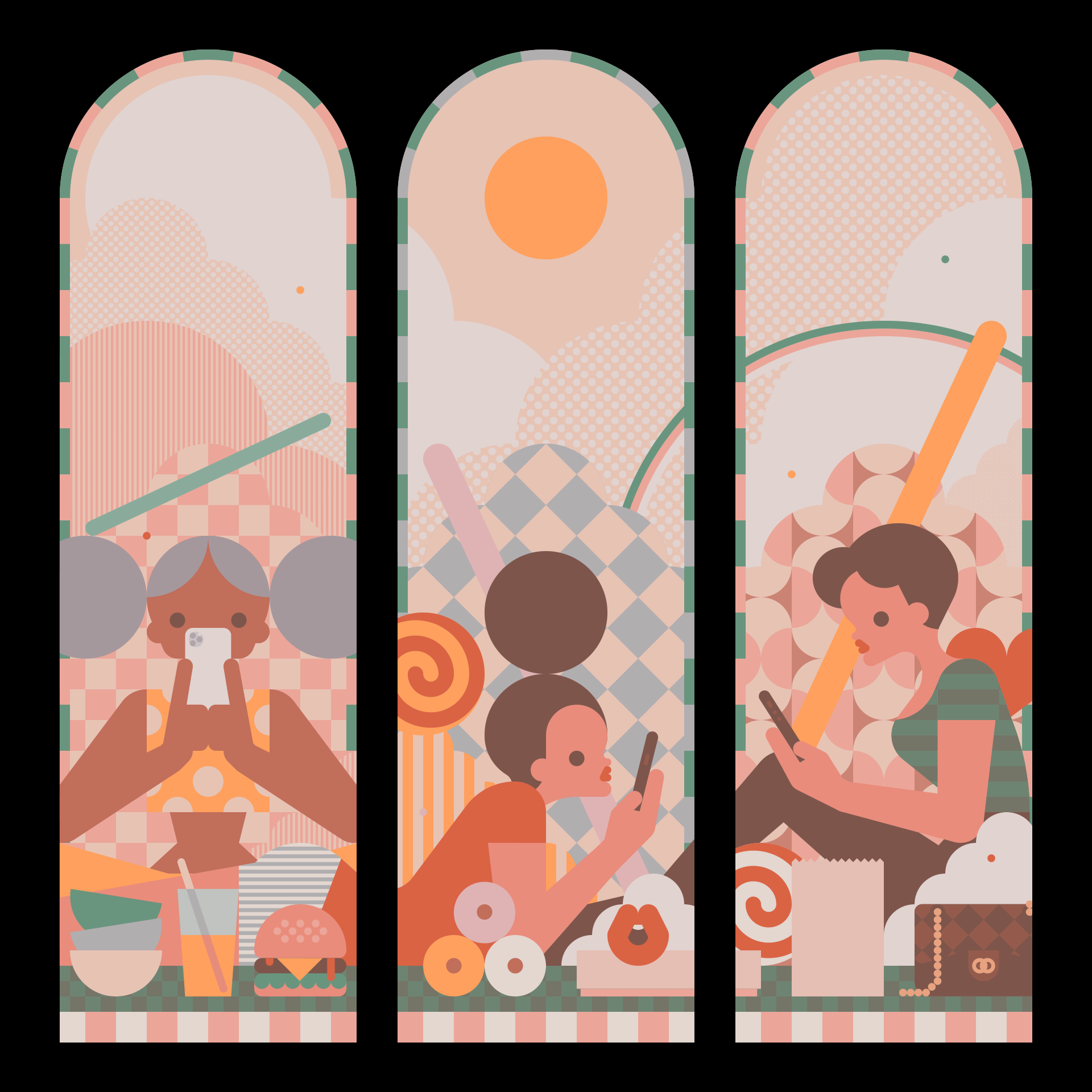
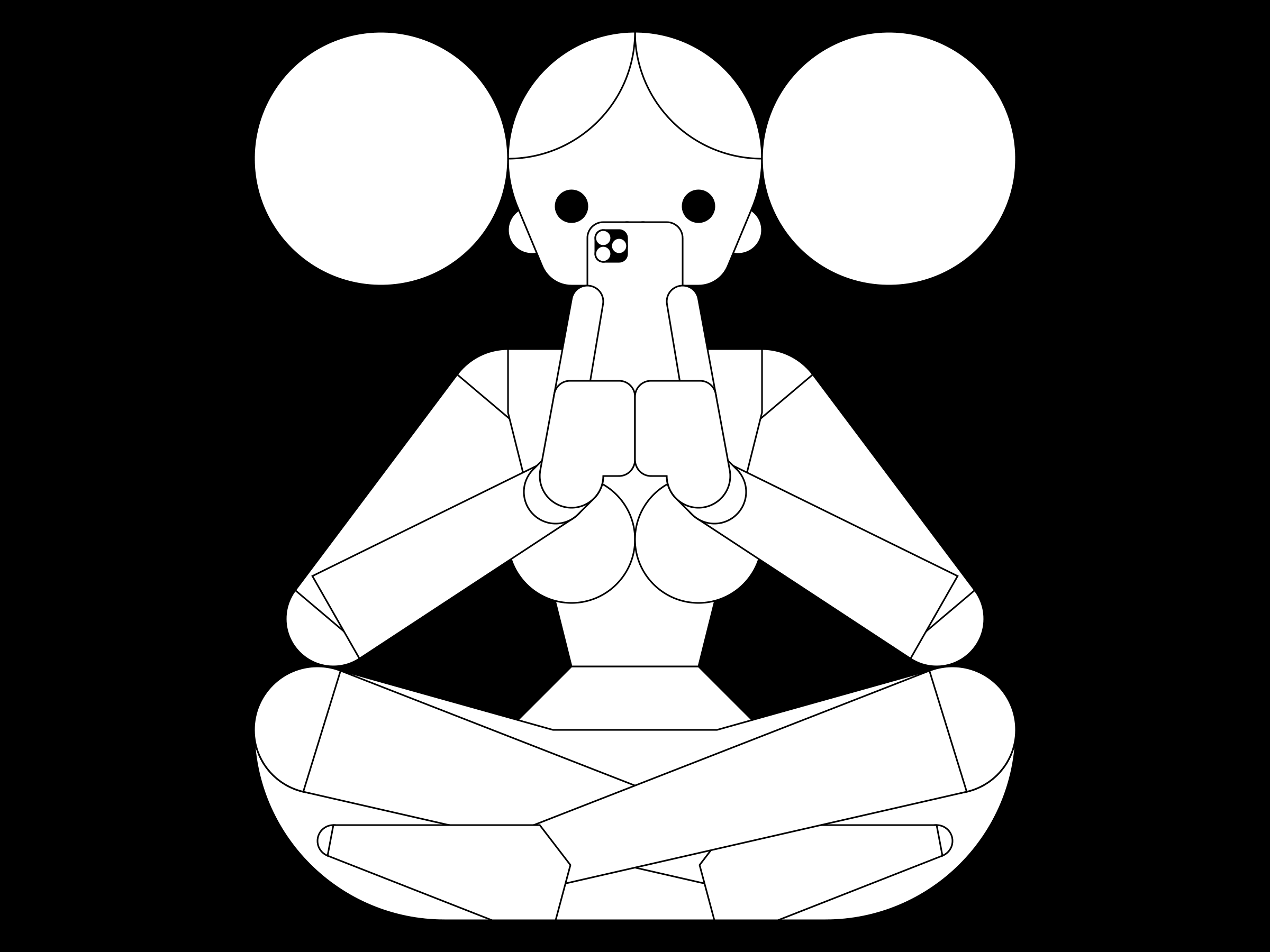
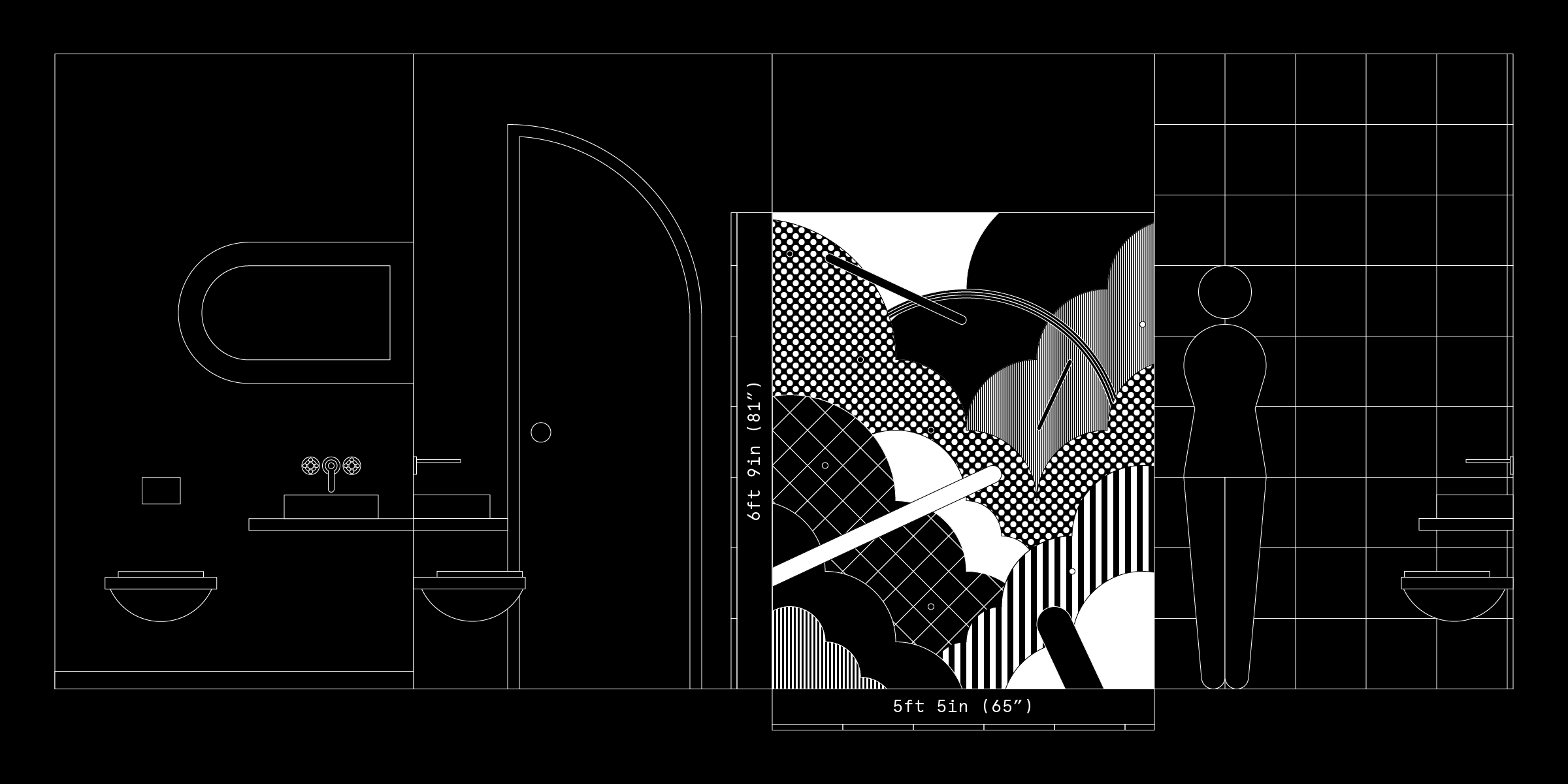
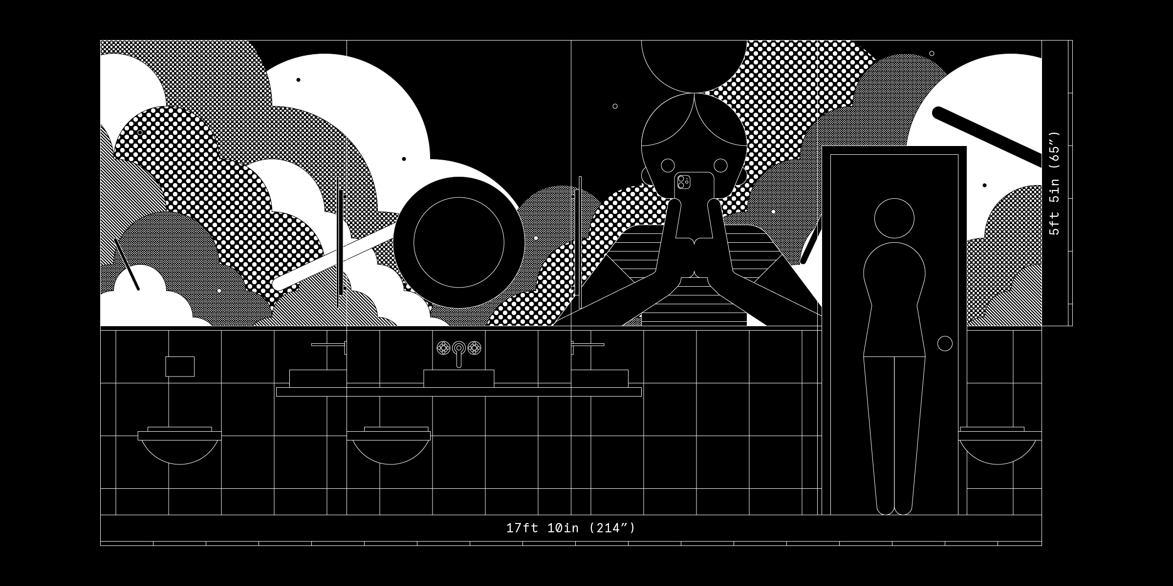
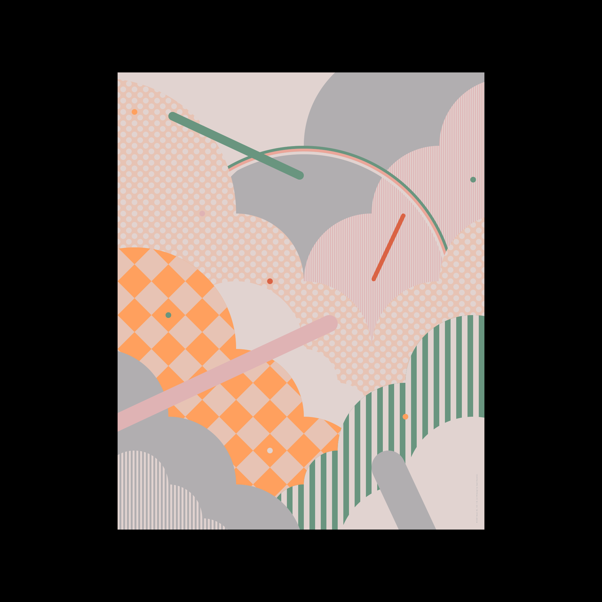
Easy
2020
Inkjet print
174 × 197 in
Illustration
|
|
|
Skyia
2019
Stationery
—
Branding
|
|
|
Kurachee
2018
Stationery
—
Branding
|
|
|
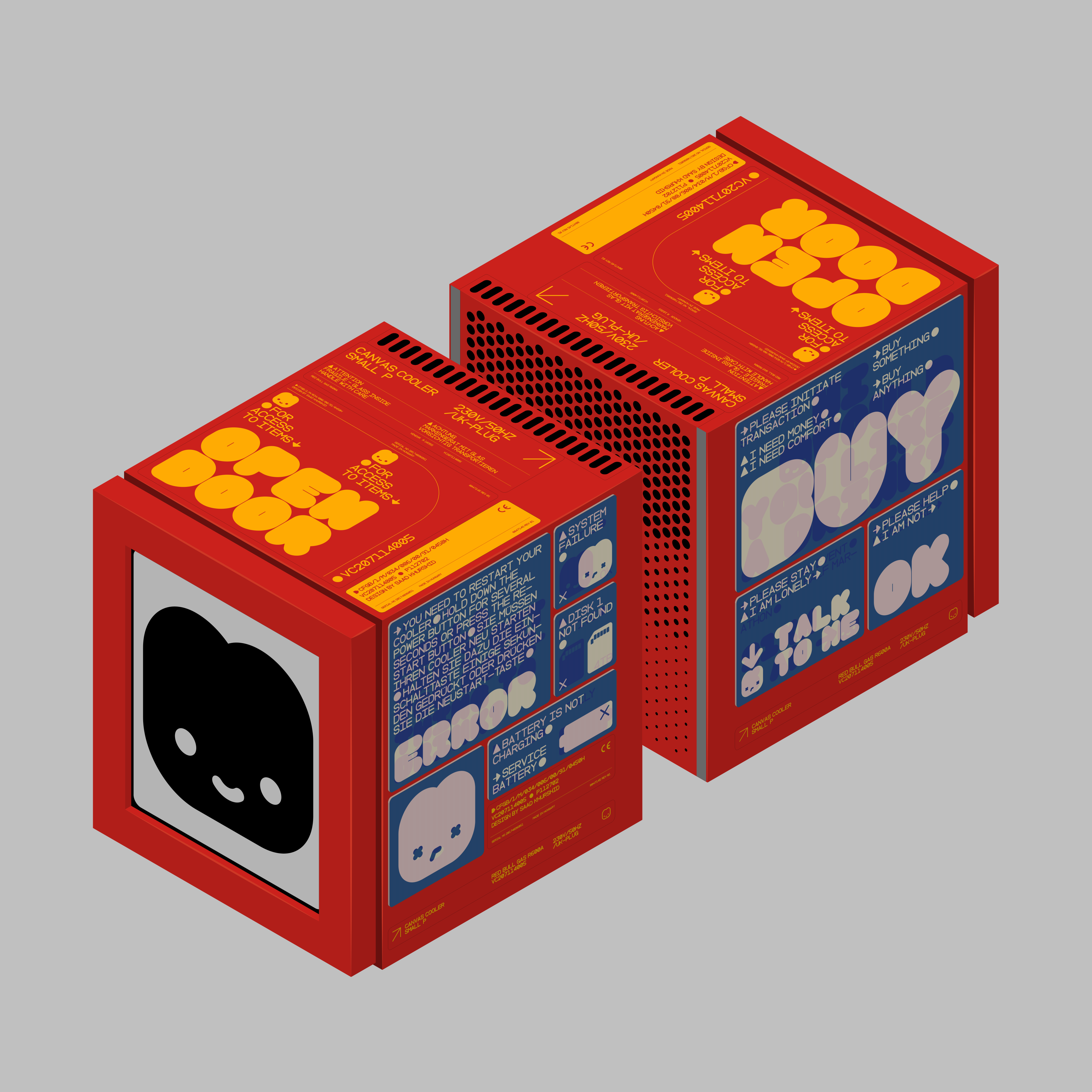
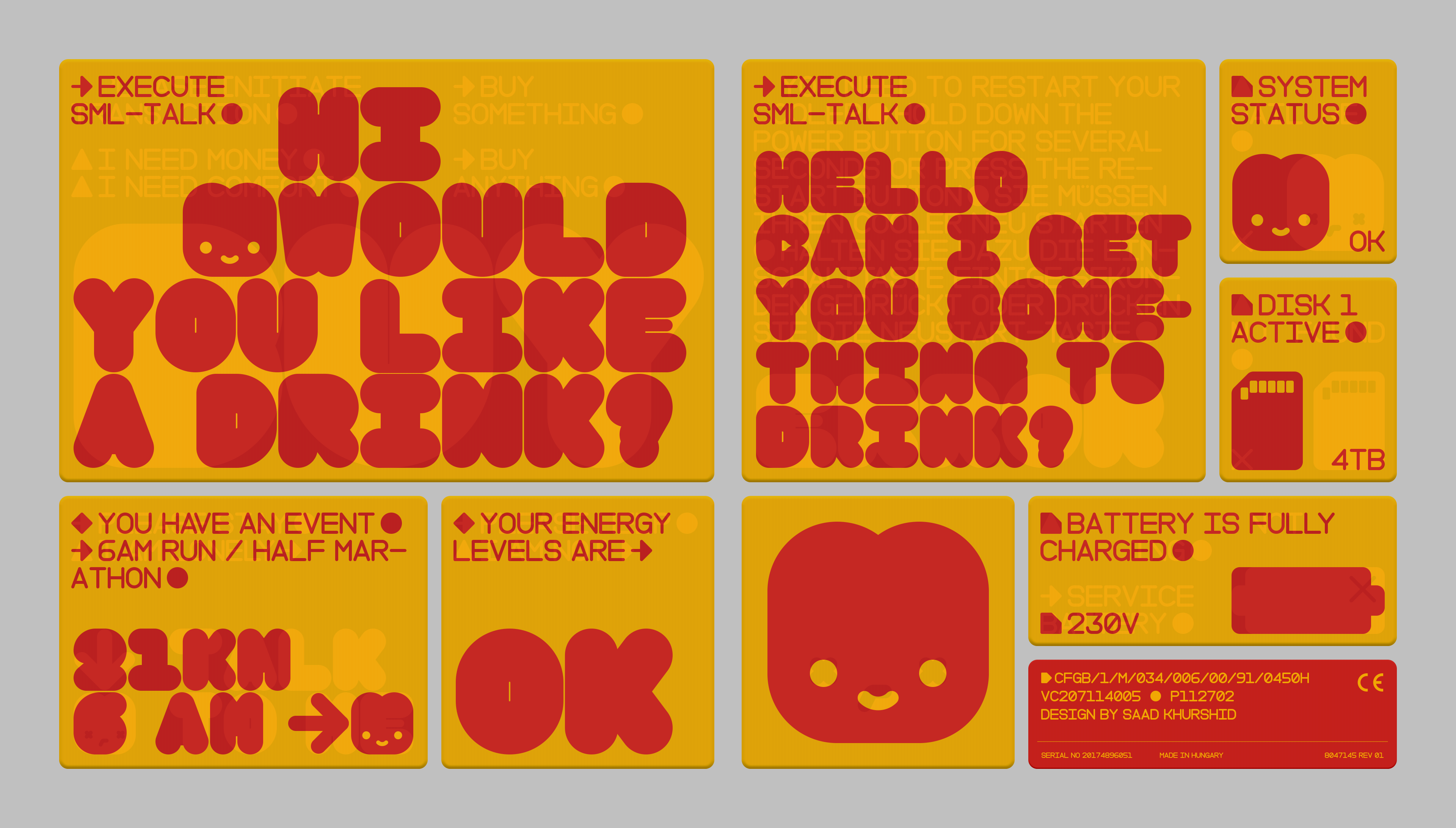
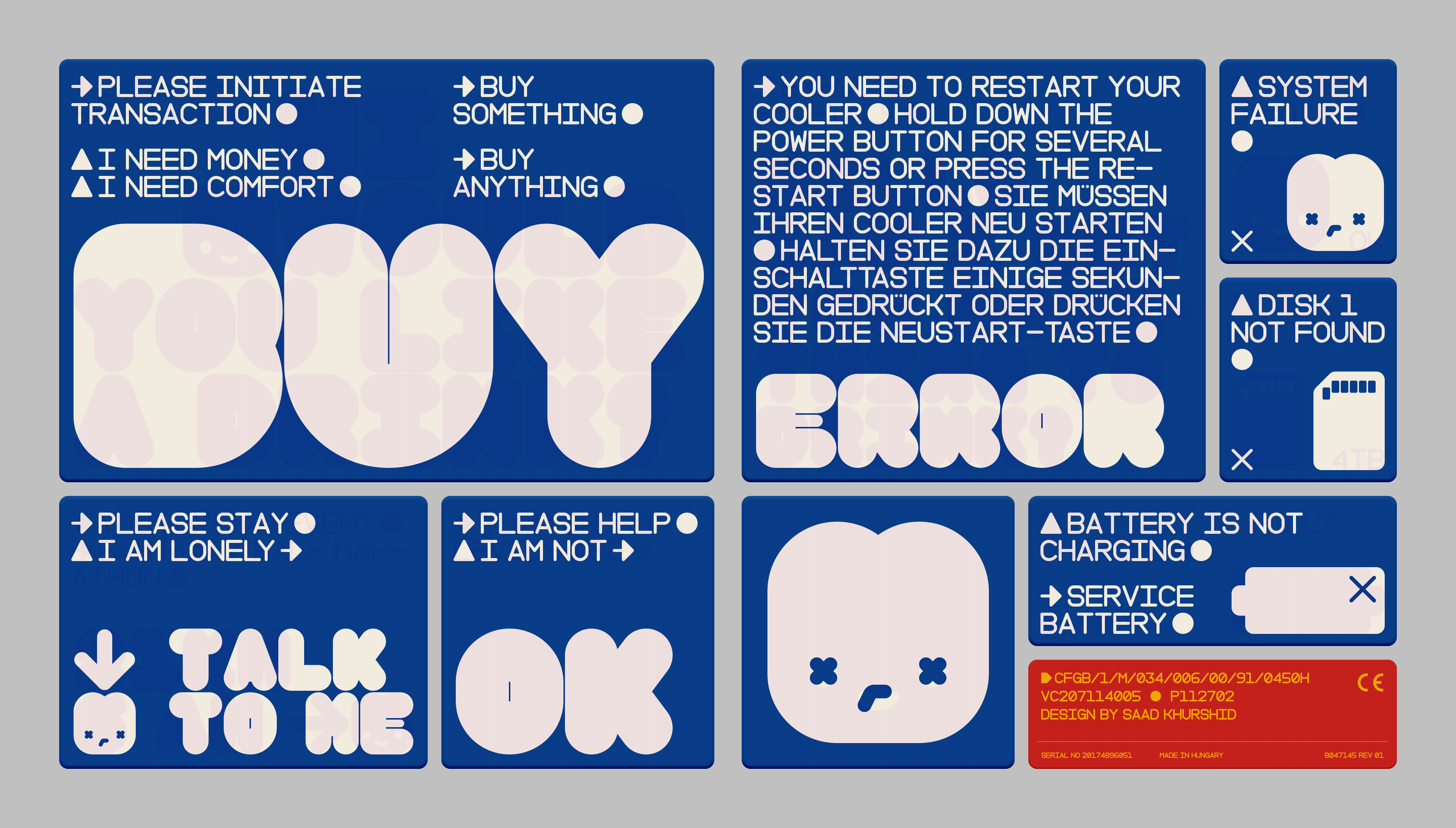
Red Bull
2018
Lenticular print
1920 × 1080 px
Exhibition
|
|
|
Nomad Coffee Studio
2018
Social Media
1080 × 1920 px
Branding
|
|
|
Nomad Coffee Studio
2017
Packaging
5 × 2.5 in
Branding
|
|
|
Nomad Coffee Studio
2017
Art Direction
Various
Branding
|
|
|
Lahore Music Meet
2017
Animation
1920 × 1080 px
Exhibition
|
|
|
Self-initiated
2017
Character Design
1∶8
Illustration
|
|
|
Self-initiated
2016
Pictogram
1080 × 1080 px
Illustration
|
|
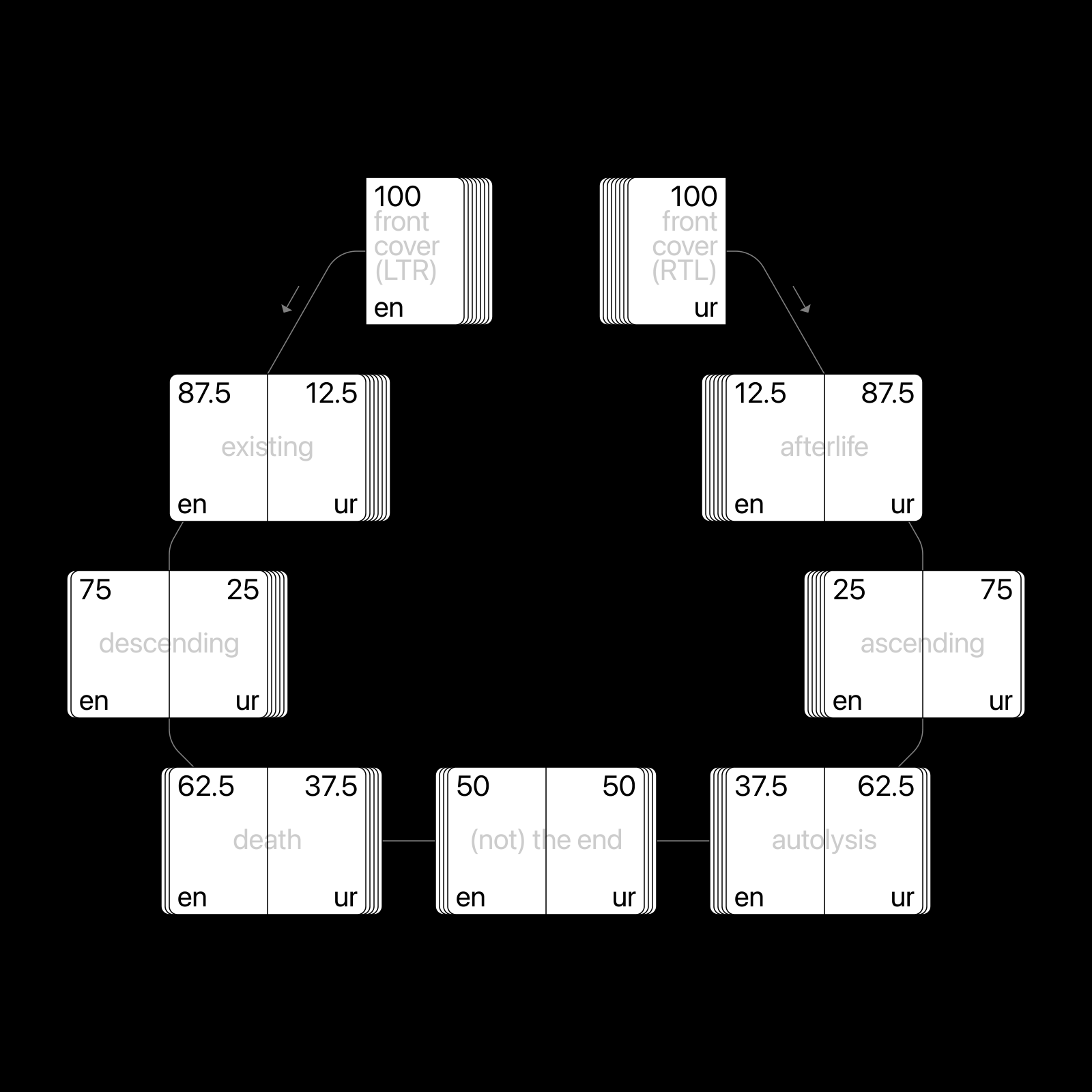
Thinking a lot about the end these days
A conceptual book, depicting how a new culture can take over an existing one. The book makes use of the opposing reading directions of the two commonly spoken languages in Pakistan: English and Urdu, to create an experimental, palindrome-like reading format. It is common in Pakistan to combine both English and Urdu when speaking. Inspired by this amalgamation, the book transitions from one language to the other. When read from the 'left to right' direction, the book talks about the experience of death (in English), from an objective / scientific point of view, where death is the end of existing. From right to left, the book focuses on life after death (in Urdu), offering a more spiritual perspective, where death is not the end of existing. |
|
|
|
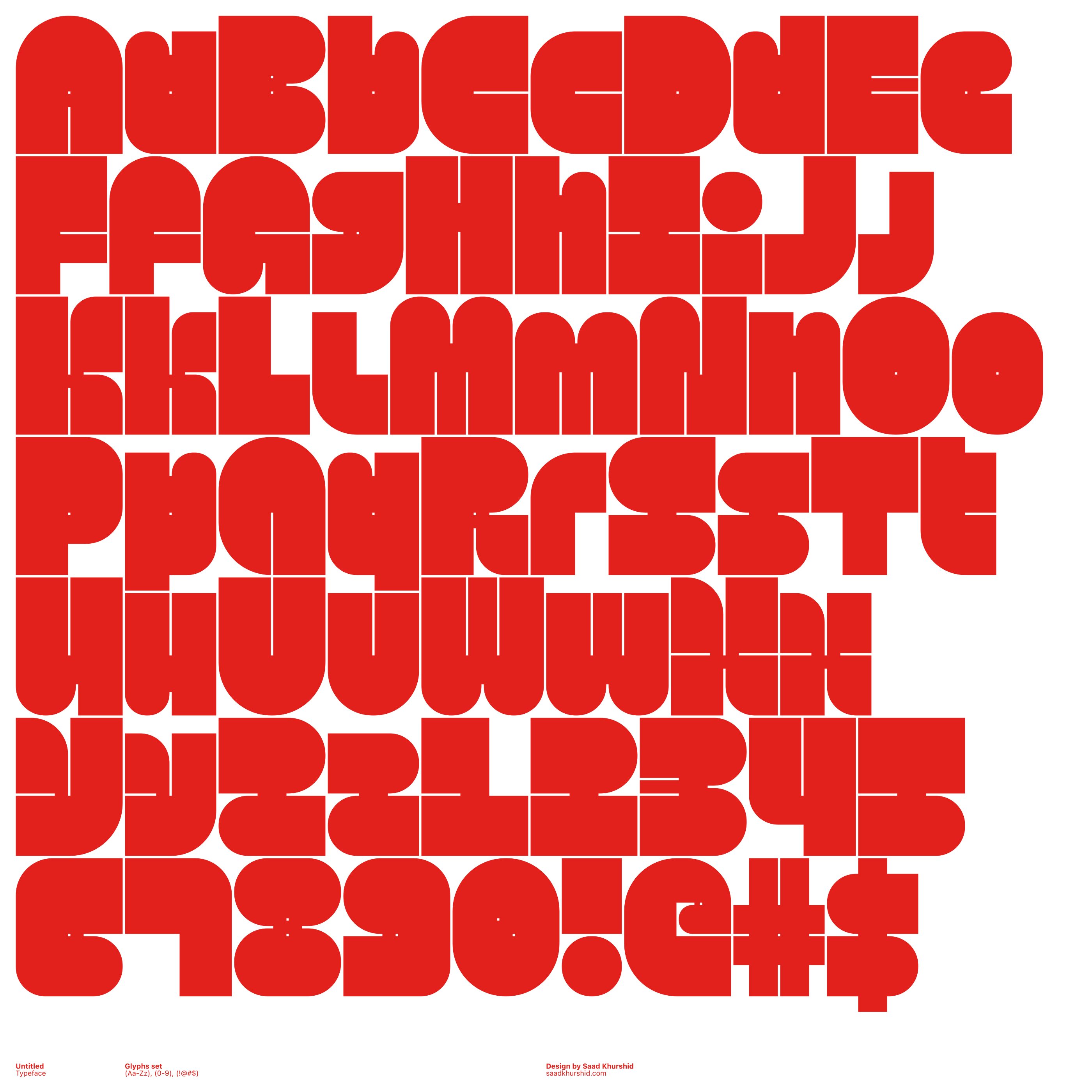
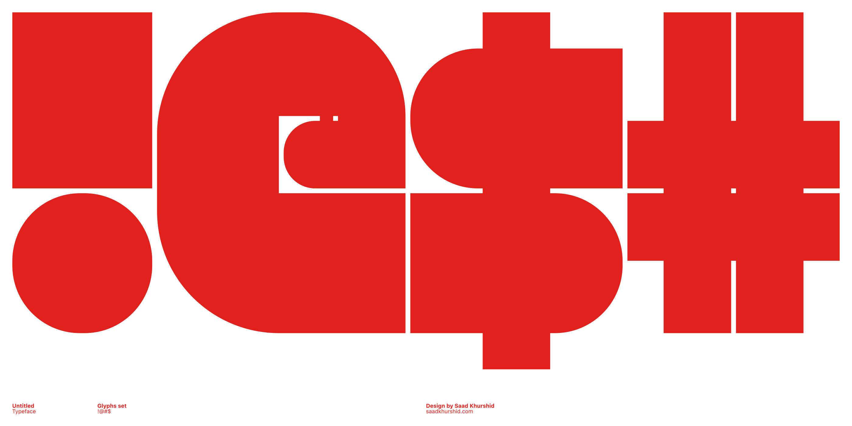
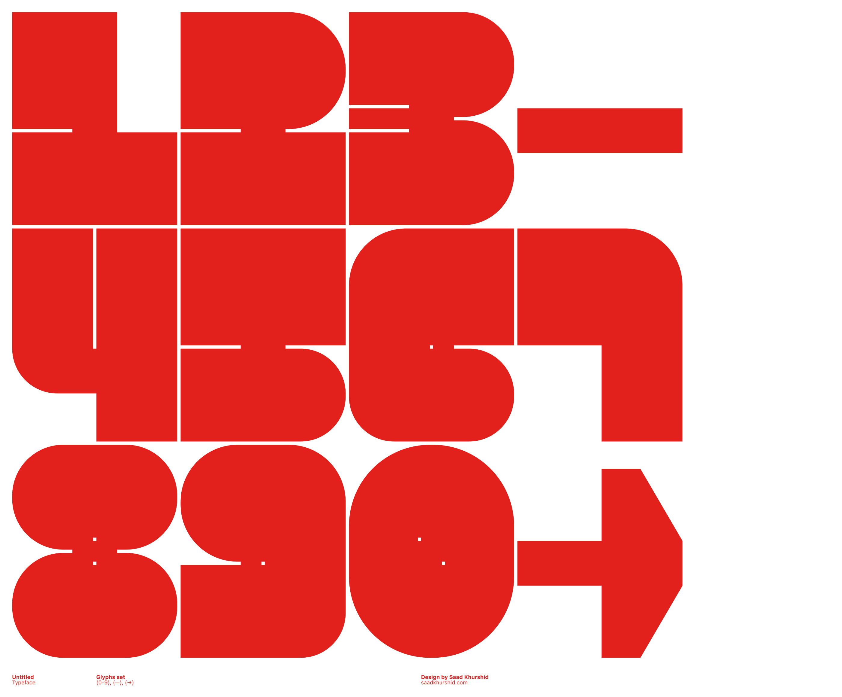
Untitled Typeface
A modular typeface based on a grid of 3:4 units. The design combines the strict monotonous rigidity of grid based, geometric shapes with unconventional typographic proportions, that are inspired by a child's head (which compared to an adult head is relatively large for its body). The typographic anatomy features minuscule counters and eyes that are placed dead-centre of the x-height, giving the typeface its characteristic bobblehead look. |
|
|
|
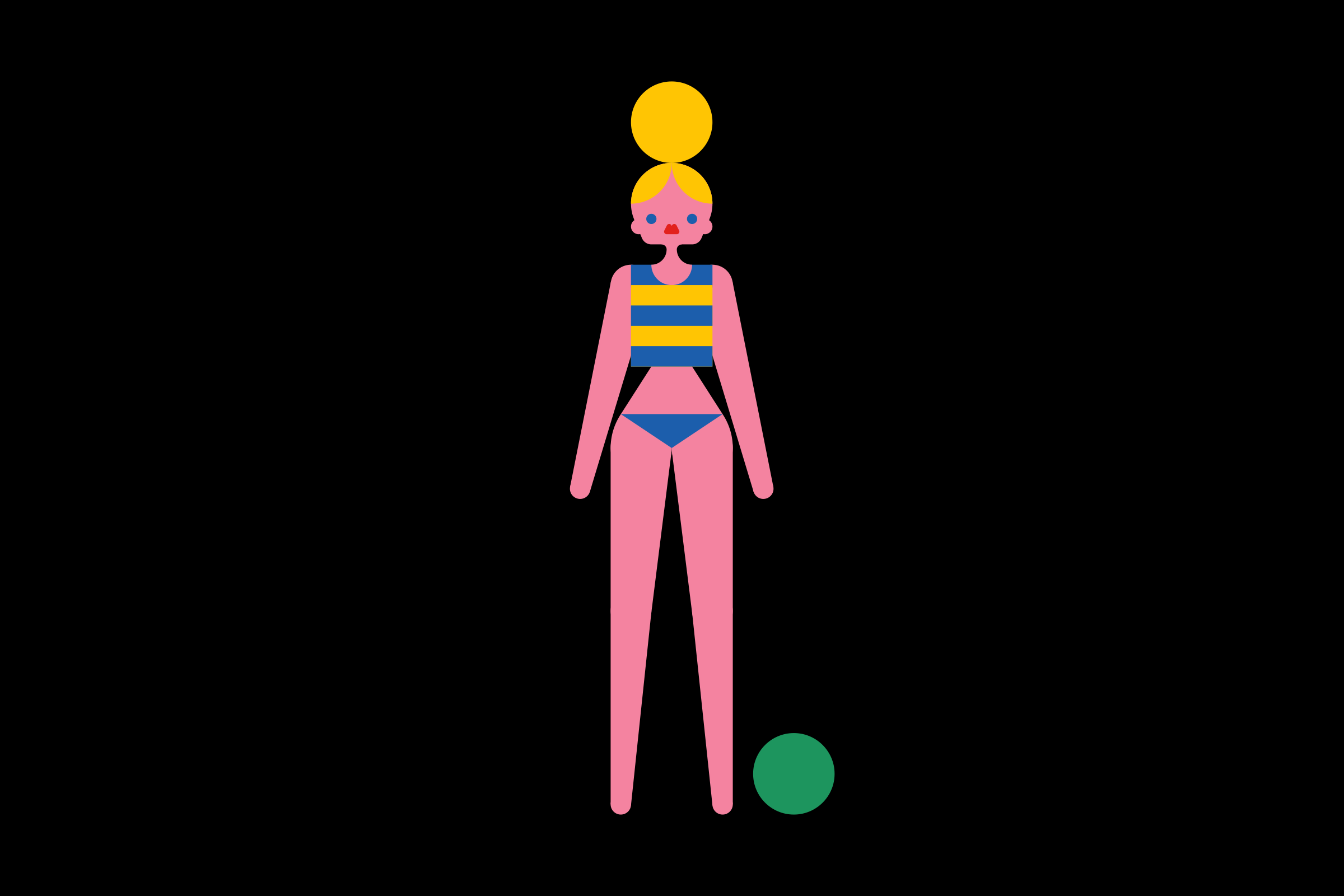
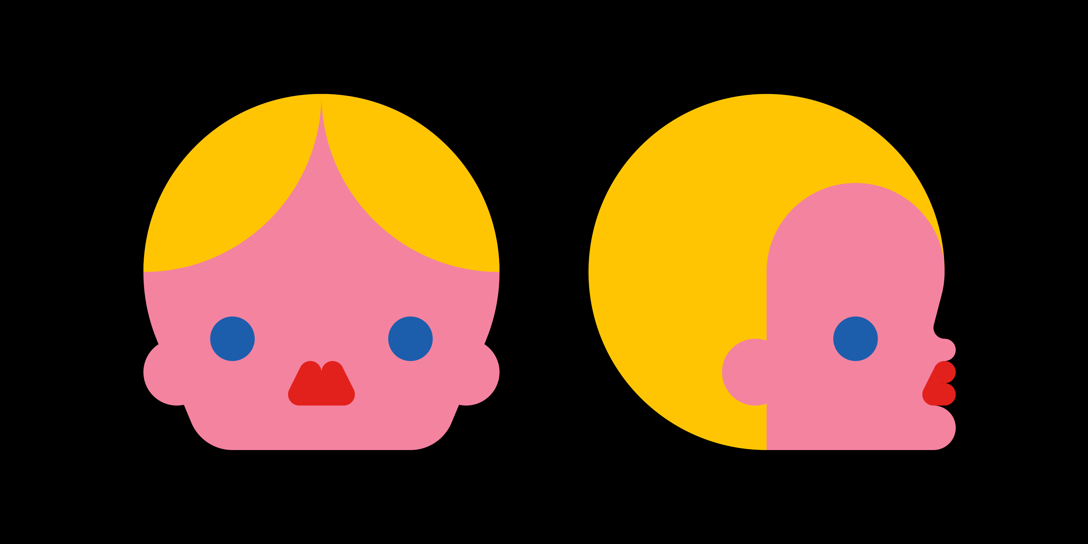
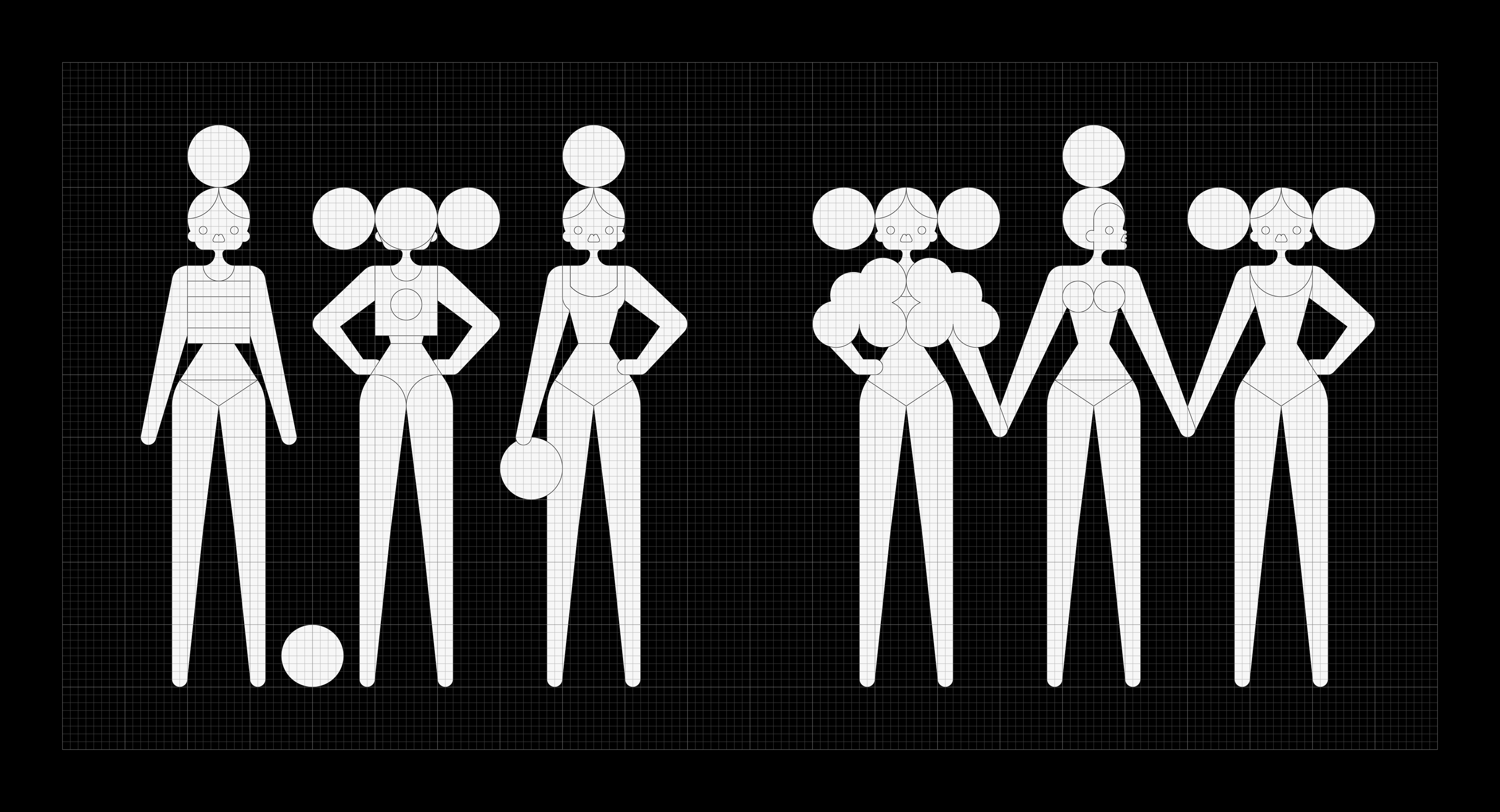
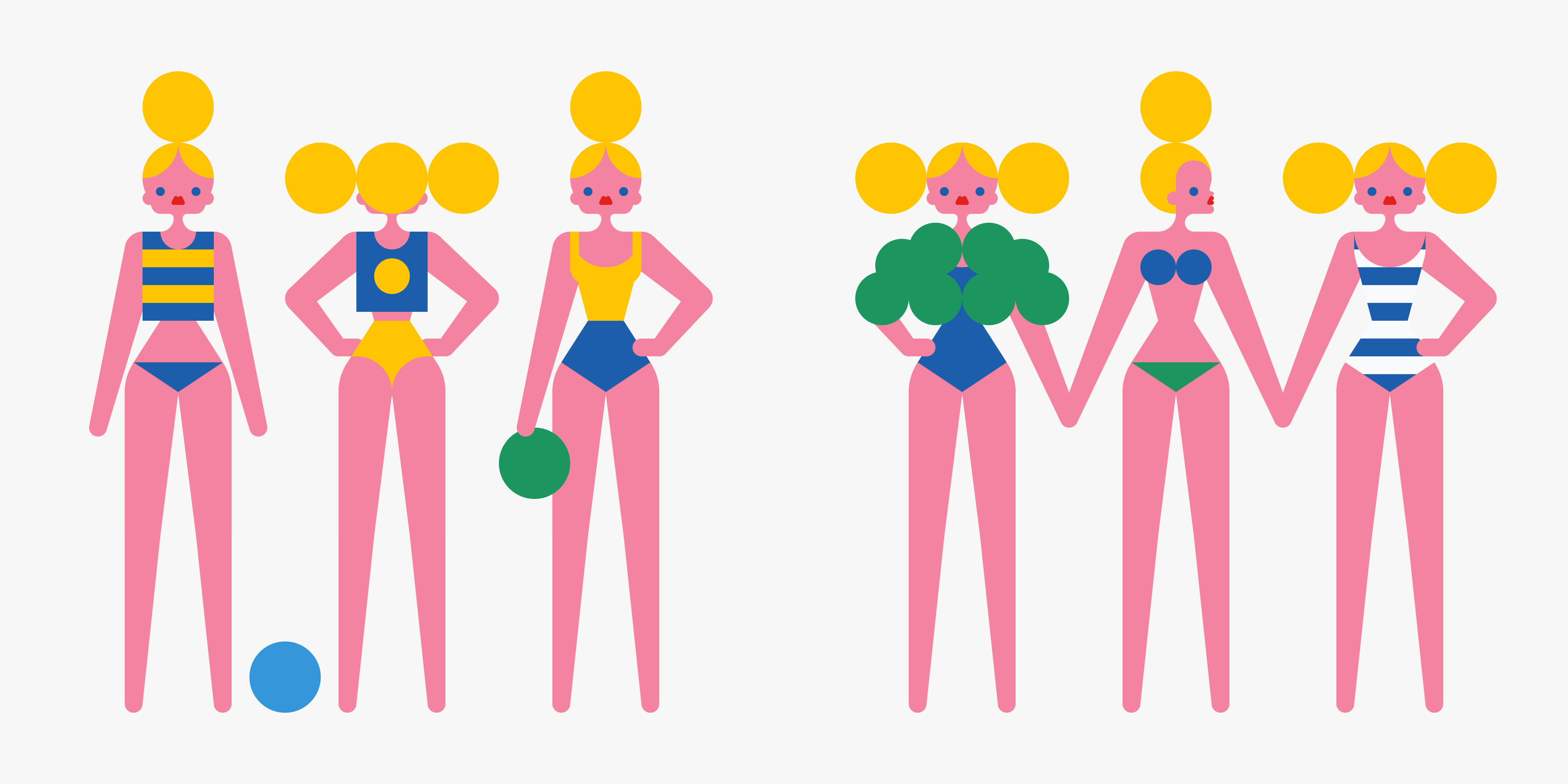
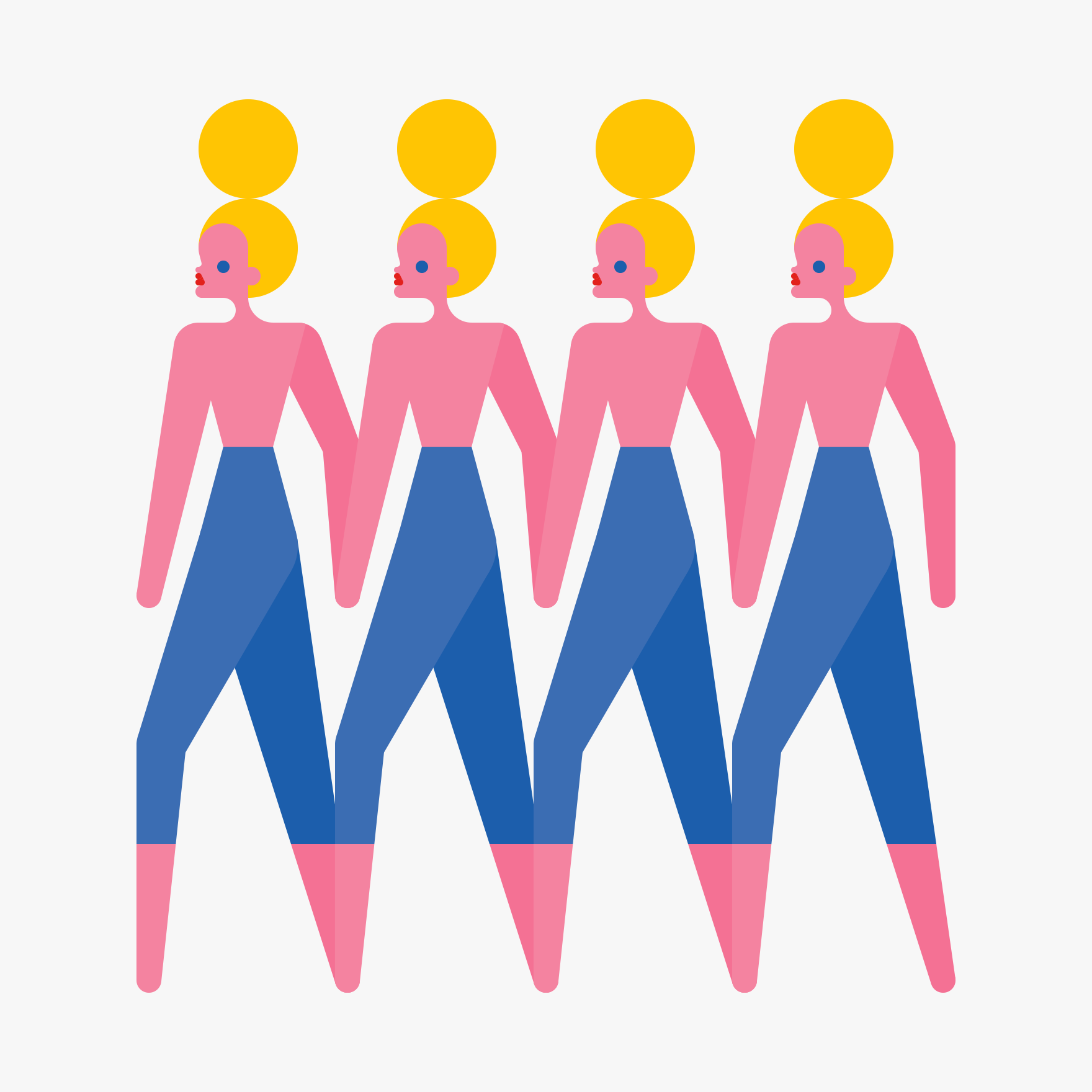
Grid Girl
Grid girl is an ongoing personal project, which started with the aim of developing a grid-based, character design system. It explores the human body as a grid-based object, constructed from basic geometric shapes, and predefined set of rules. The proportions of the body are based on a head to body ratio of 1:8. In the structure of the head, the eyes are enlarged and placed well below the equator, resulting in a super-youthful appearance. |
|
|
|
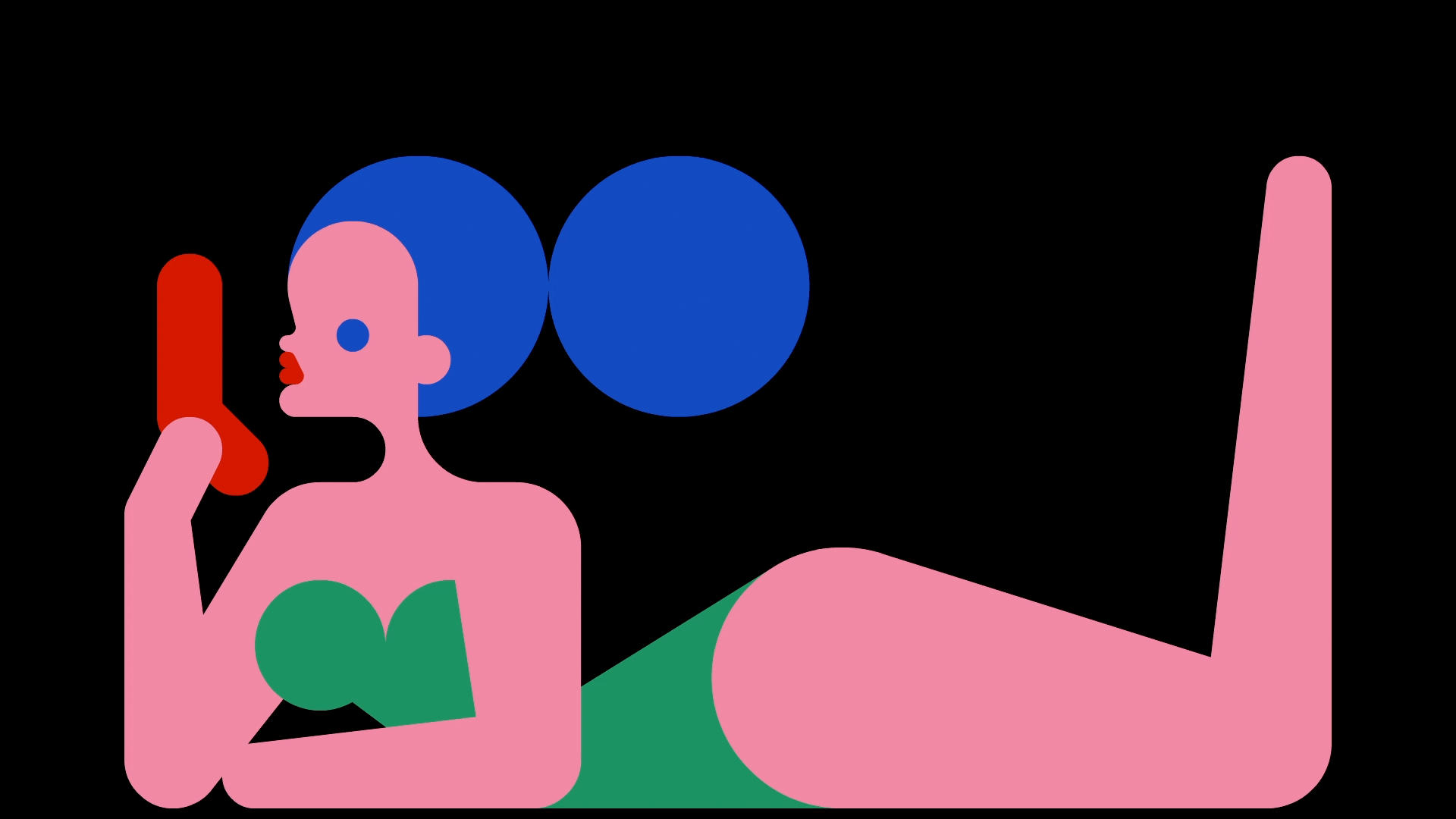
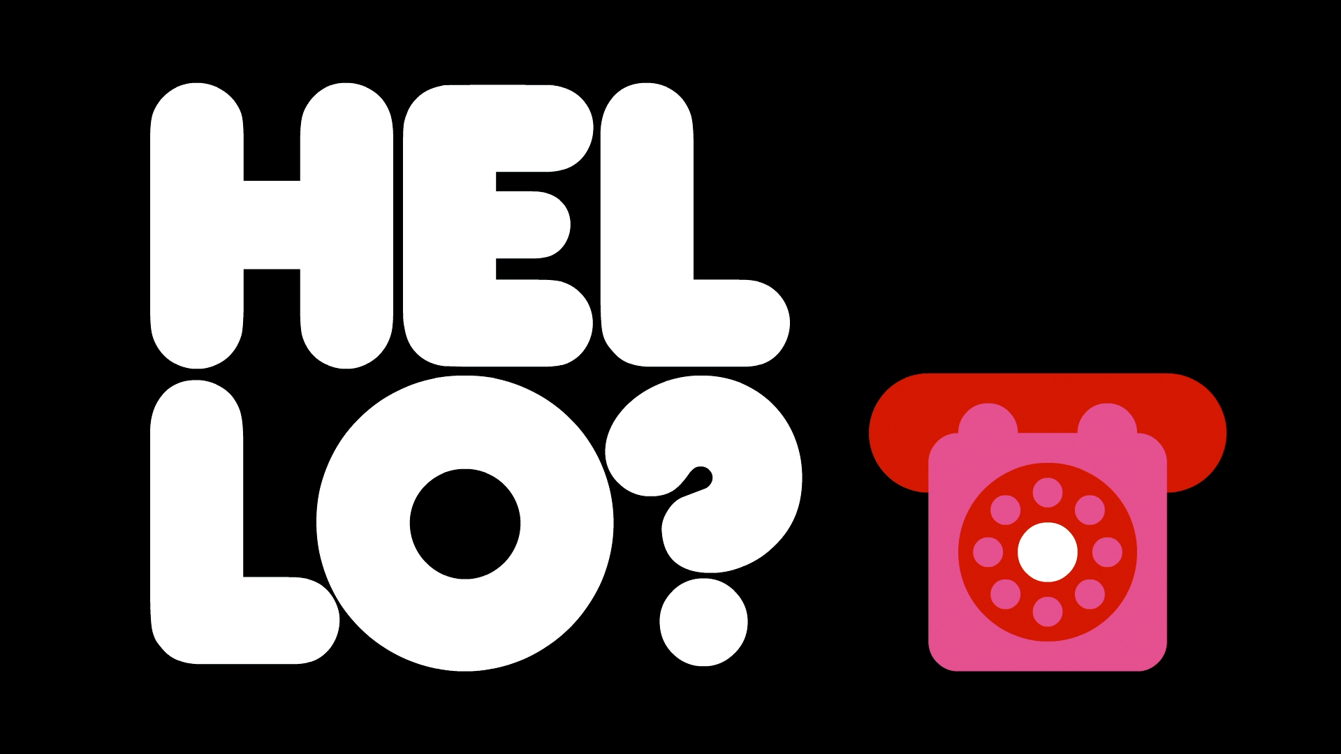
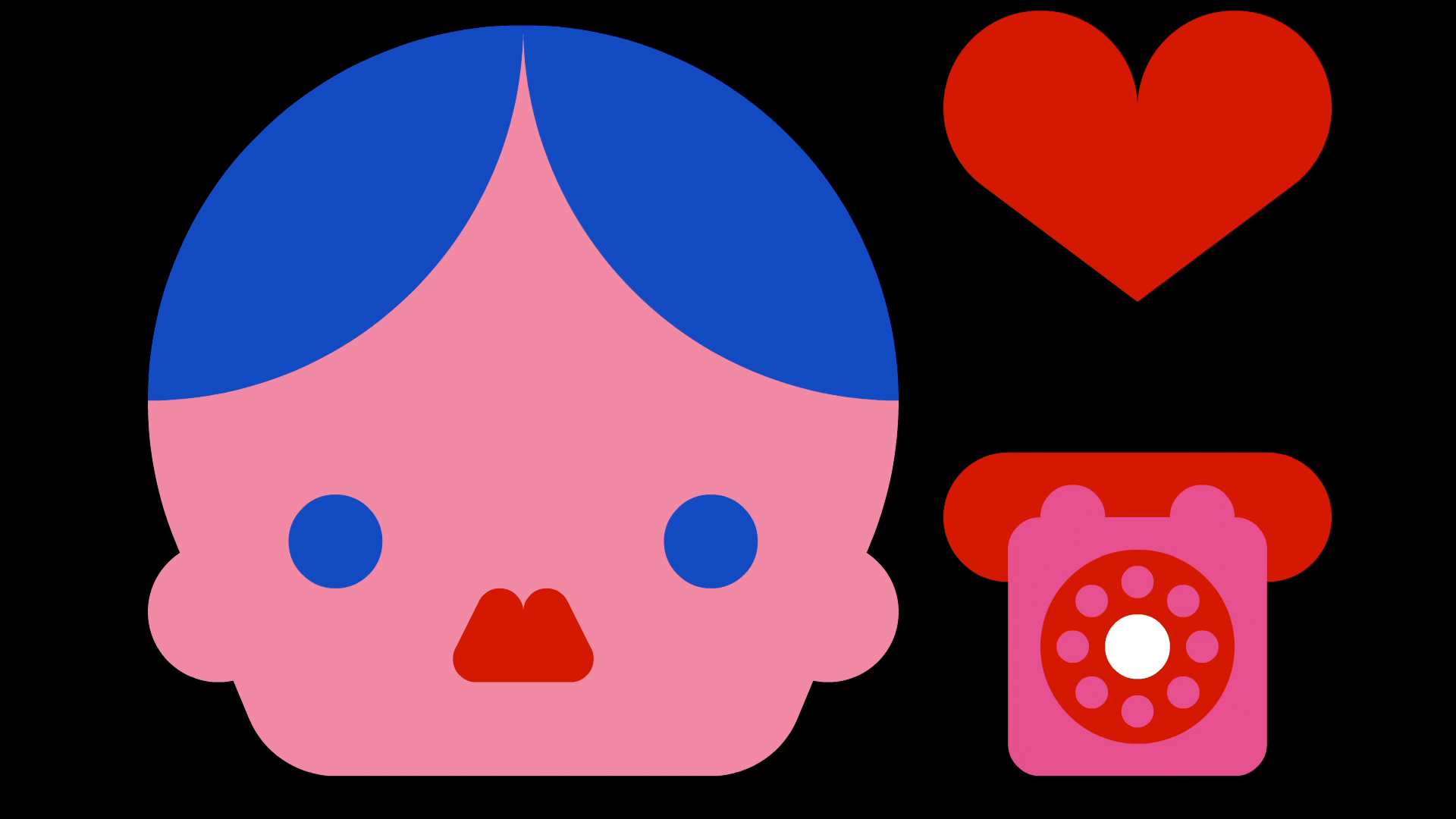
Telephone Love
An animated video projection with sound (play on Vimeo). Exhibited at Alhamra Art Council, for the Lahore Music Meet festival. The animation is based on the popular Pakistani song— ’Telephone Pyar’ (1987) by Nazia Hassan. Which is about a girl who is in love with a strange and mysterious caller. The installation aims to entice the feeling of joy and ecstasy that the girl experiences upon hearing the voice of the stranger. |
|

|
|
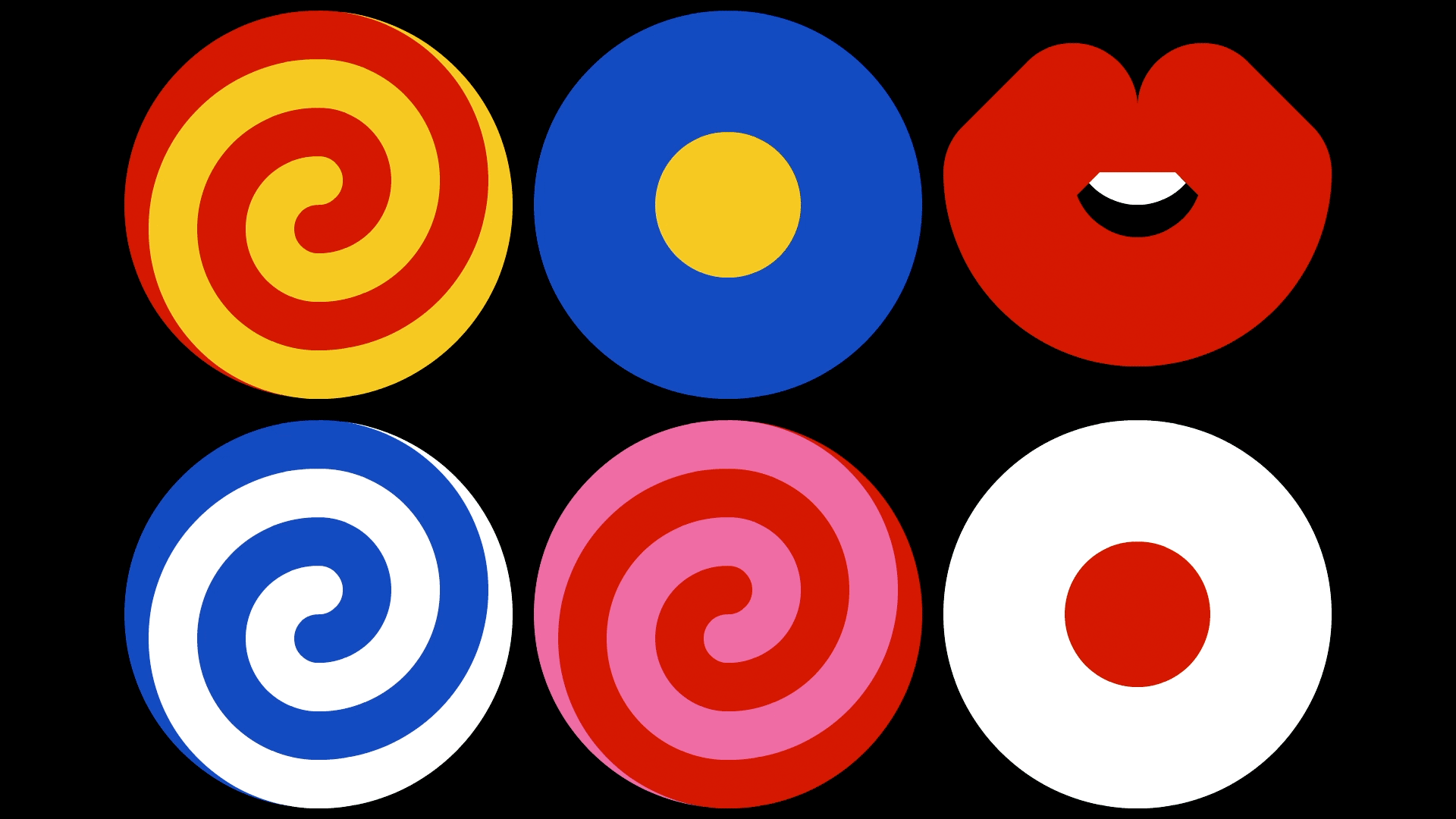
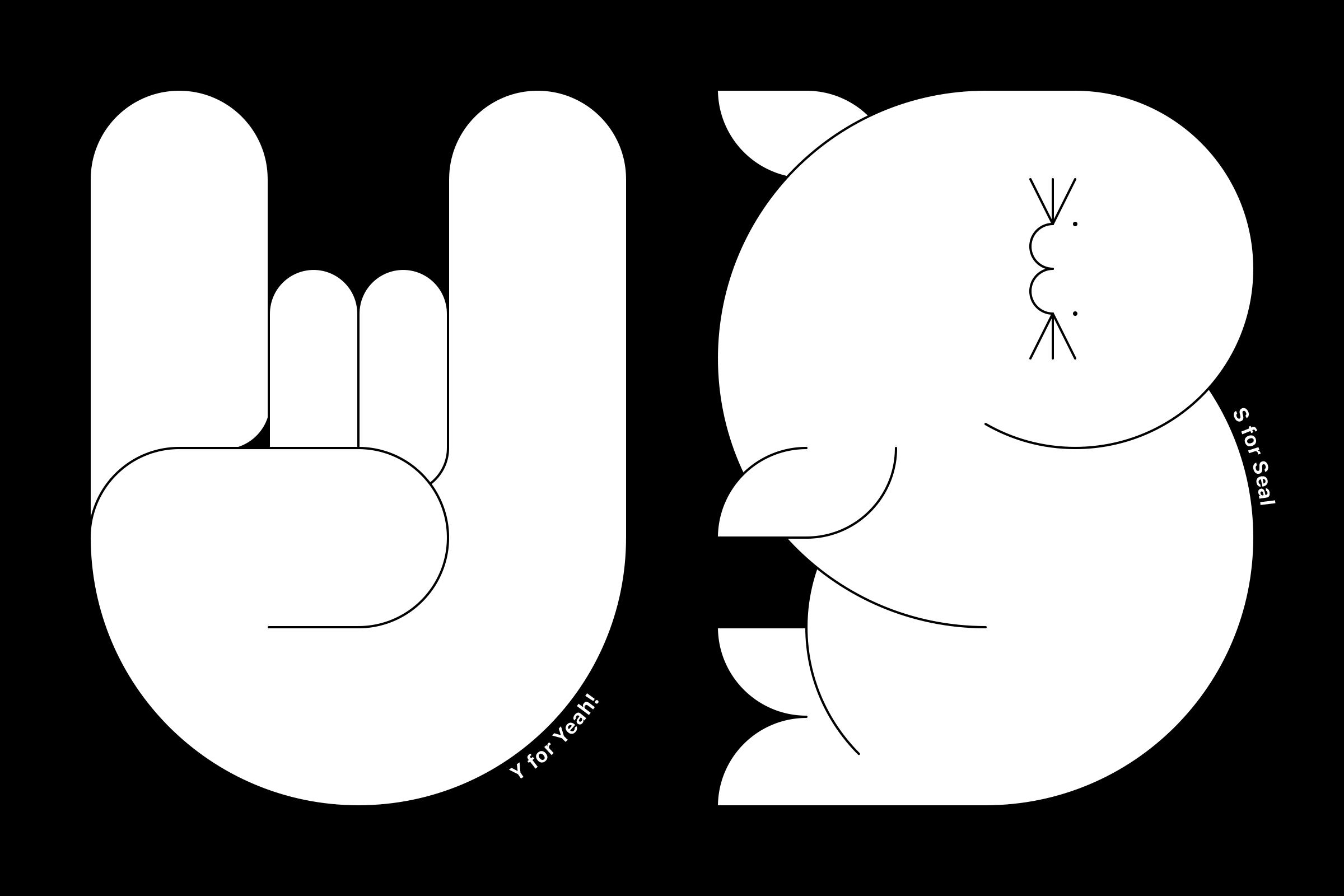
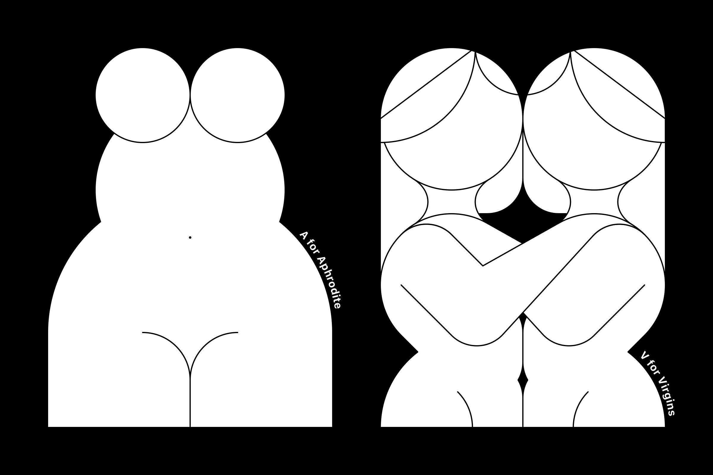
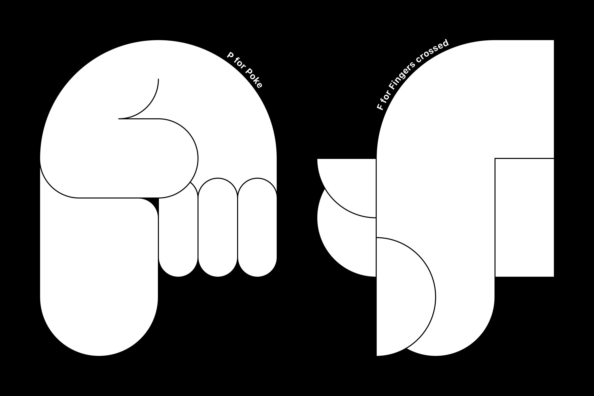
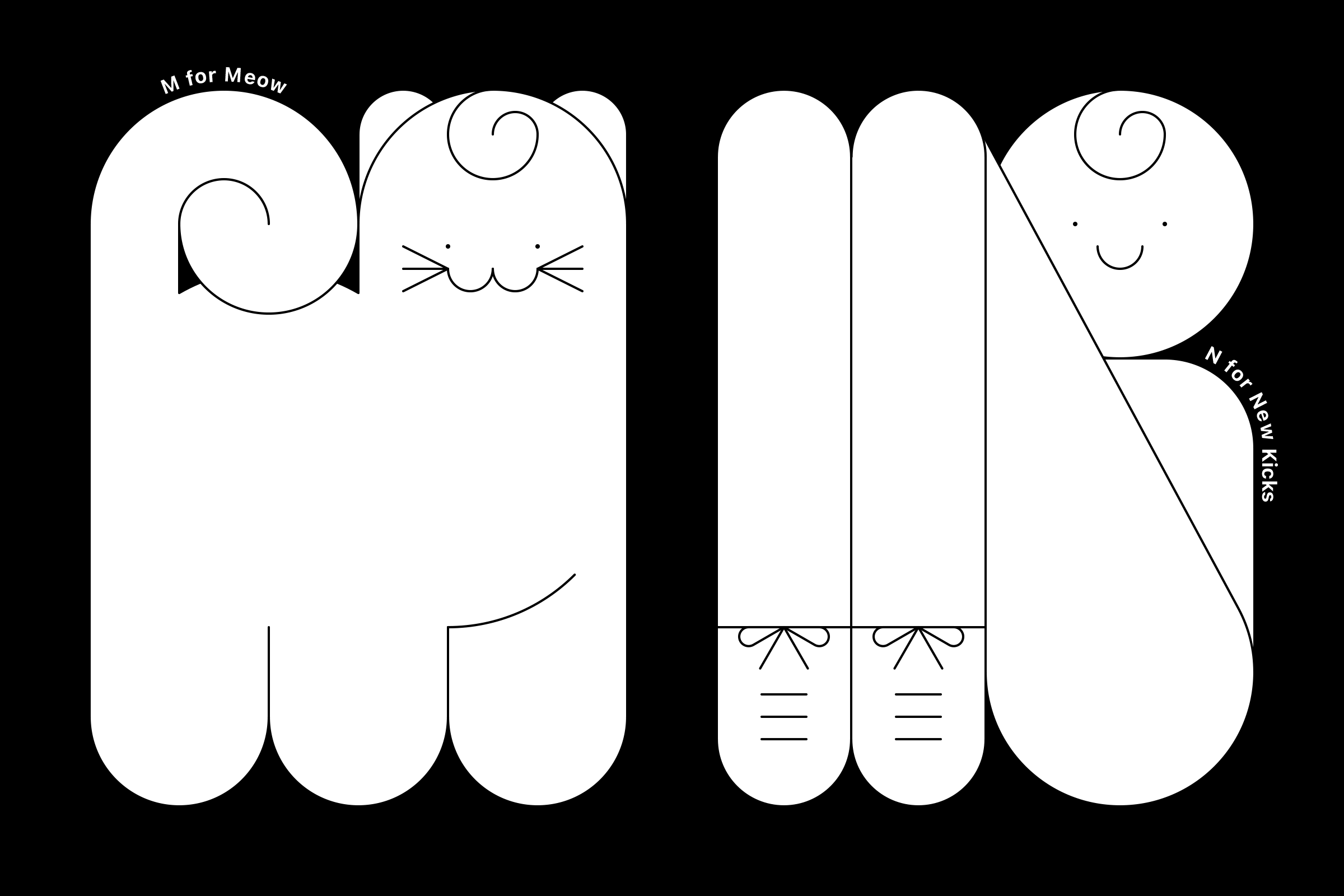
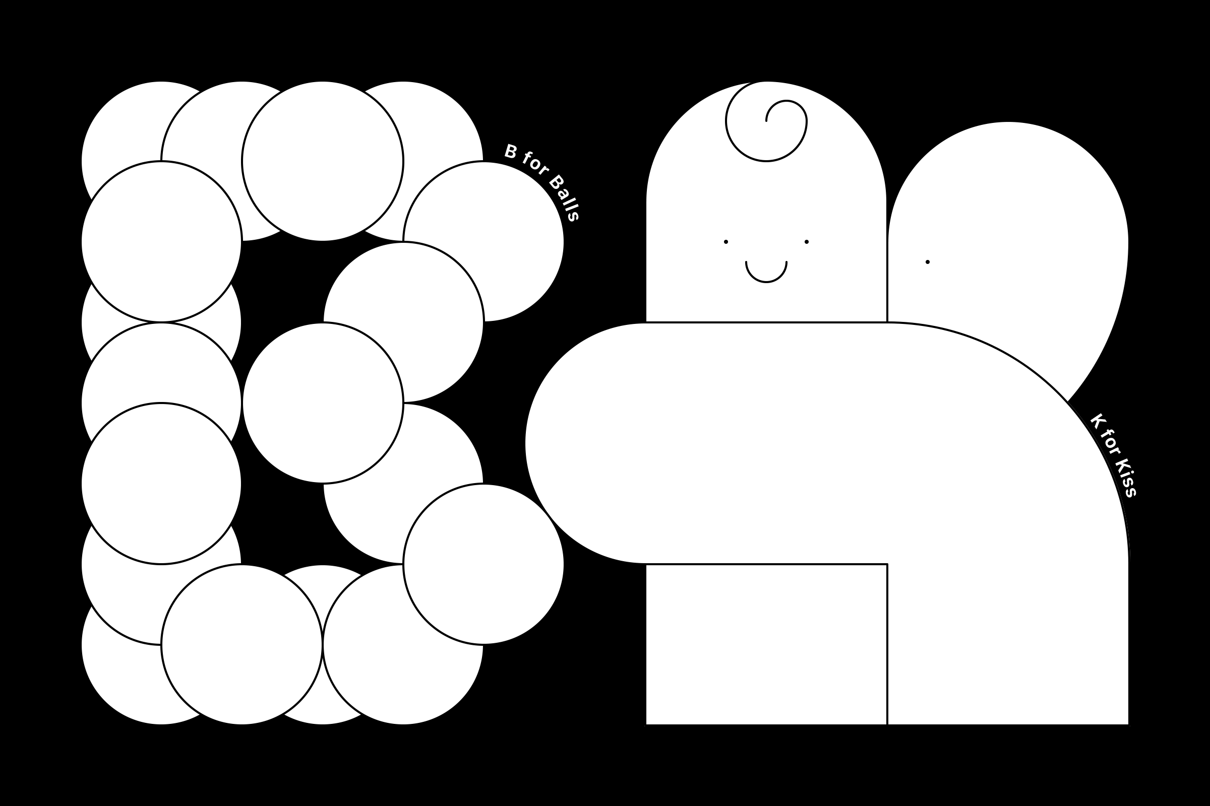
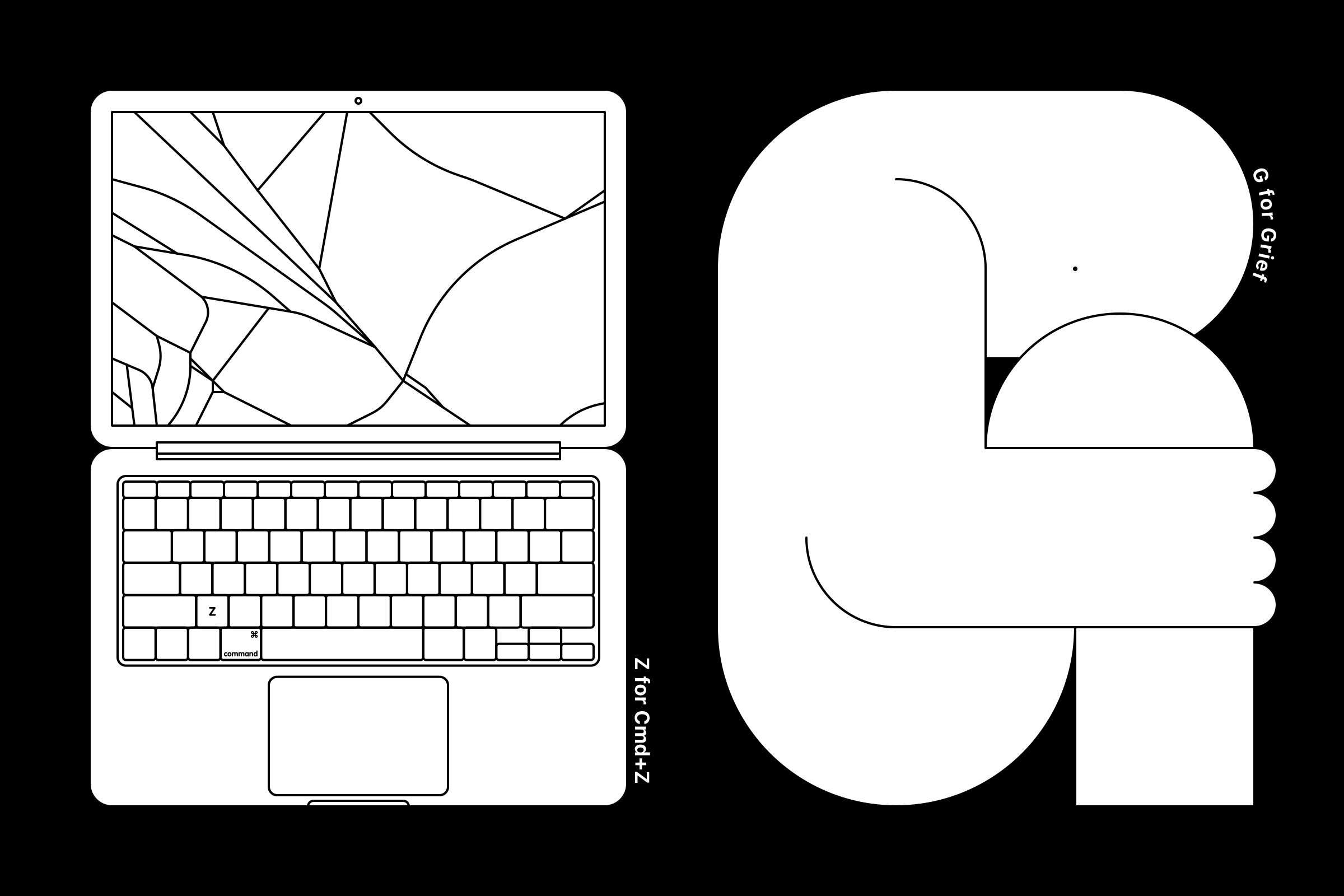
36 Days of Type
The task was to design all the letters of the alphabet (a-z) as well as the numbers (0-9) everyday. For the challenge, I came up with two rules: 1. Every alphabet will be an illustration that depicts a noun or verb that starts with the very same letter. 2. Each typographic illustration will be based on a fixed grid of 6x8 units. |
|
|
|
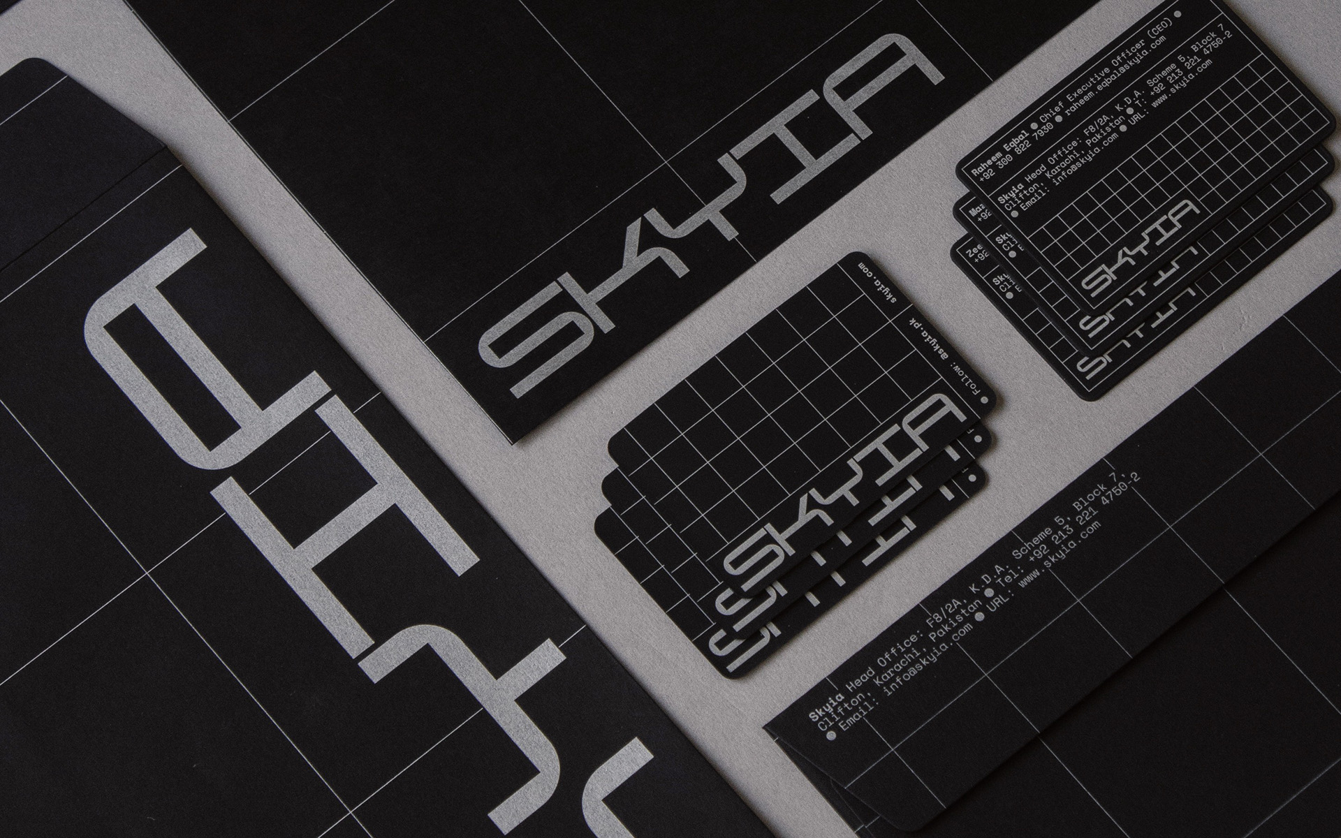
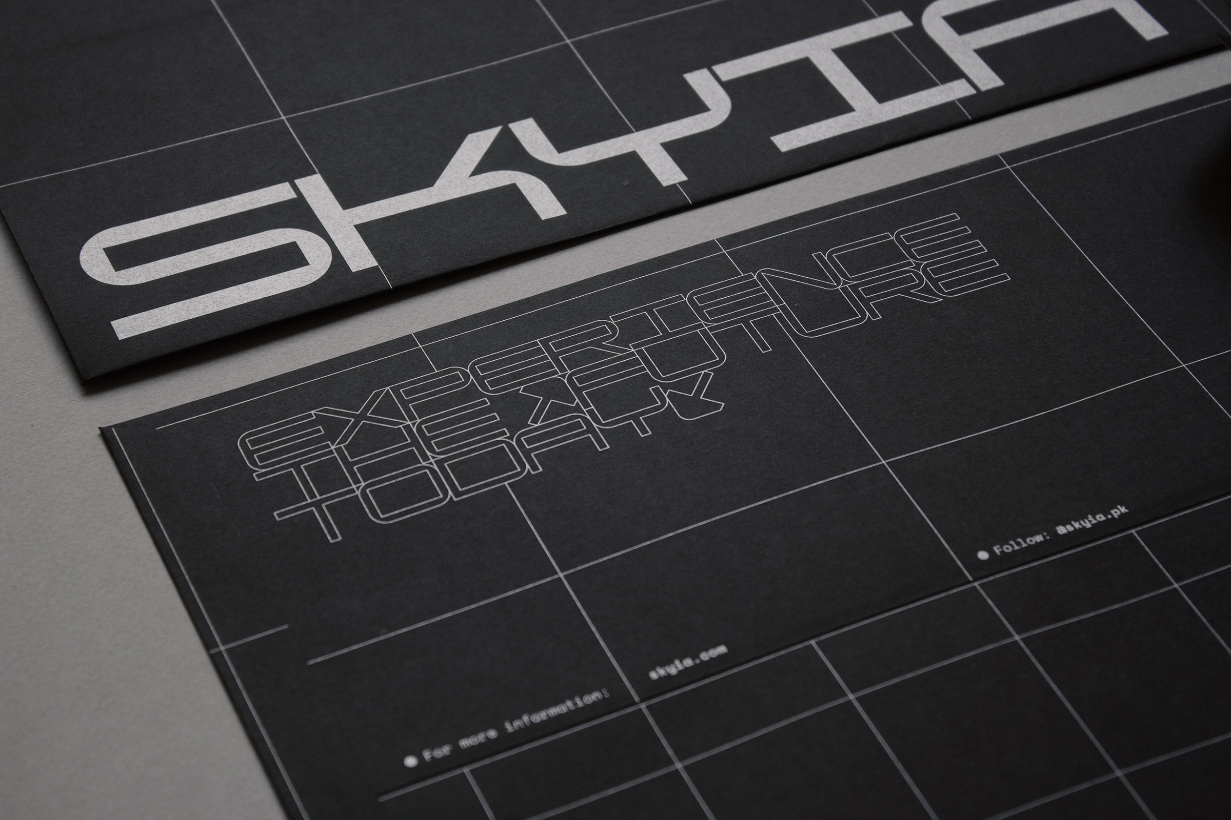
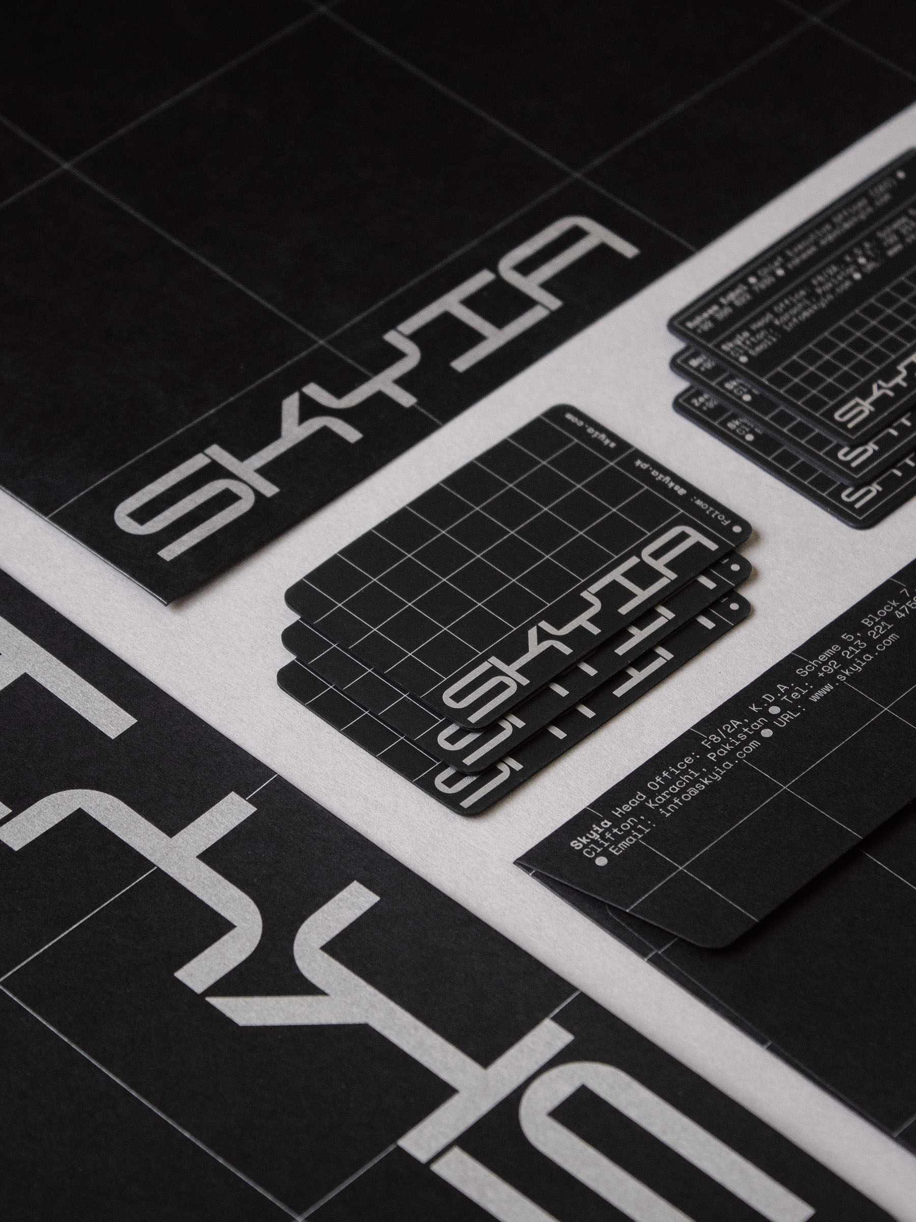
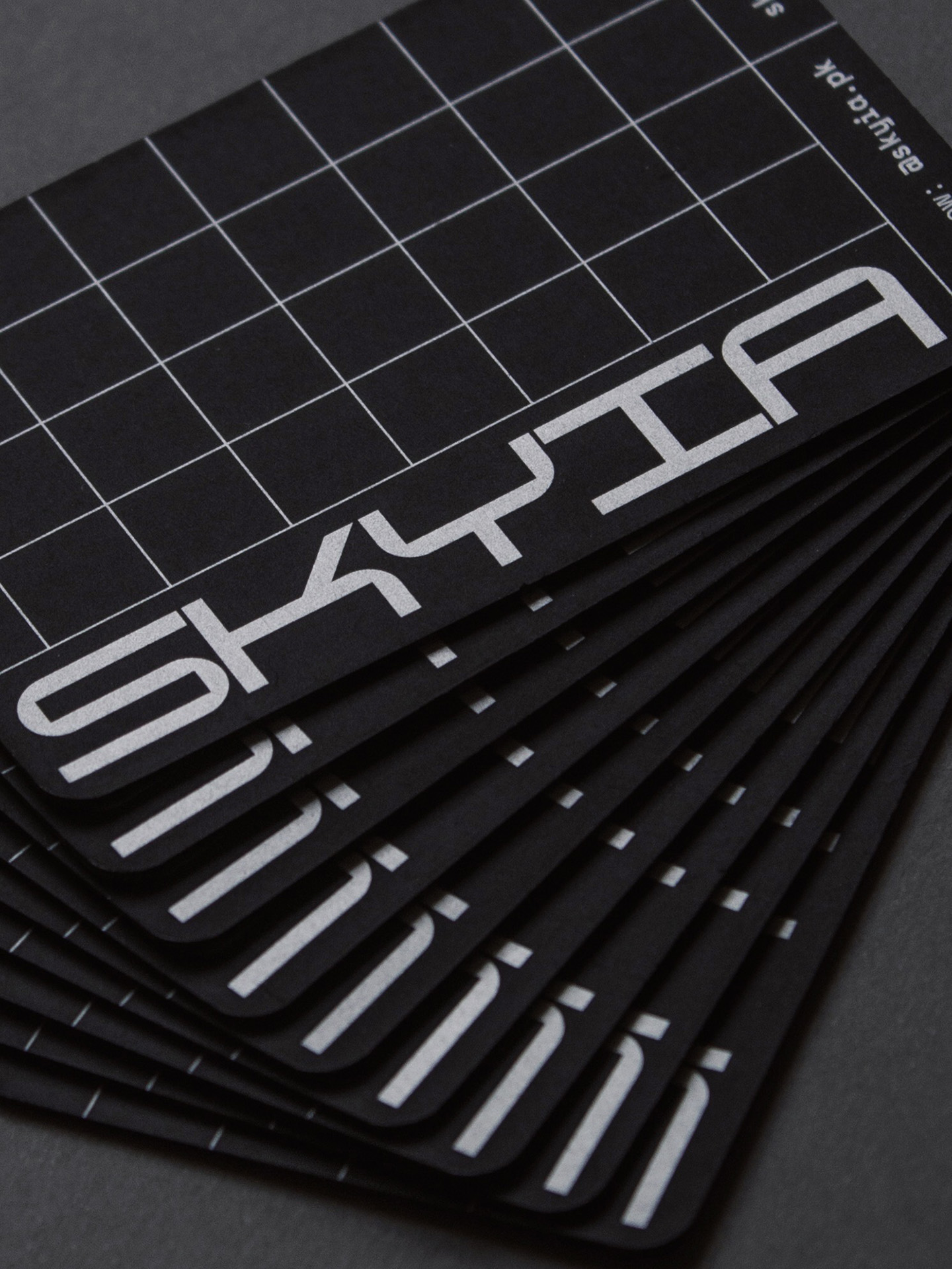
Skyia Identity
Designed the identity for a home automation company, which included a futuristic, extended width typeface. In the identity, grids are used as a design element. The complexity of the grid patterns increases in an exponential sequence: 4x4, 8x8, 16x16. The three set of grid patterns represent the three eras of technology— Analog → Digital → A.I. |
|
|
|
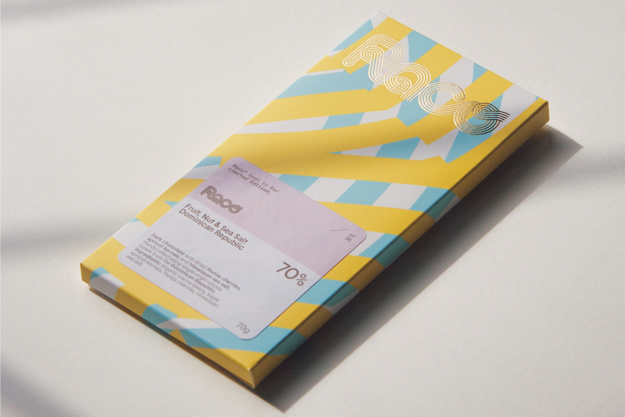
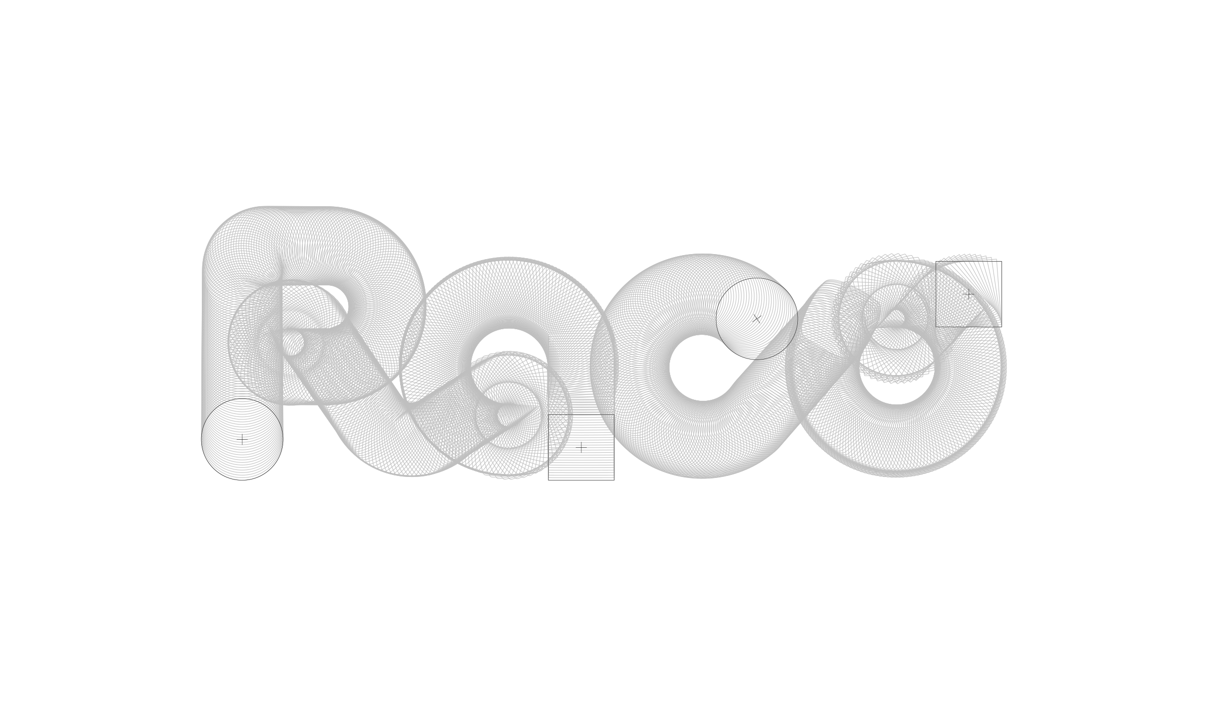
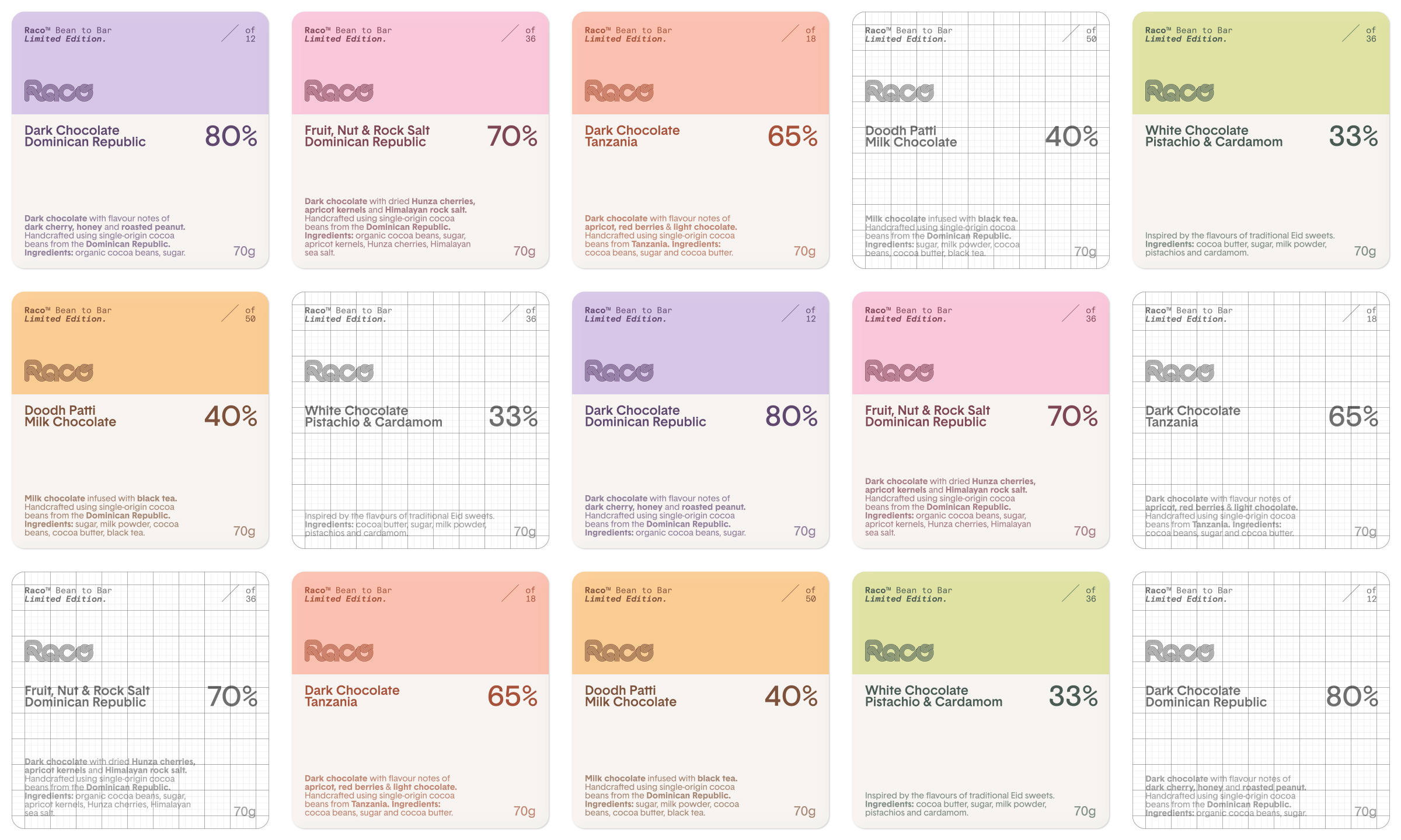
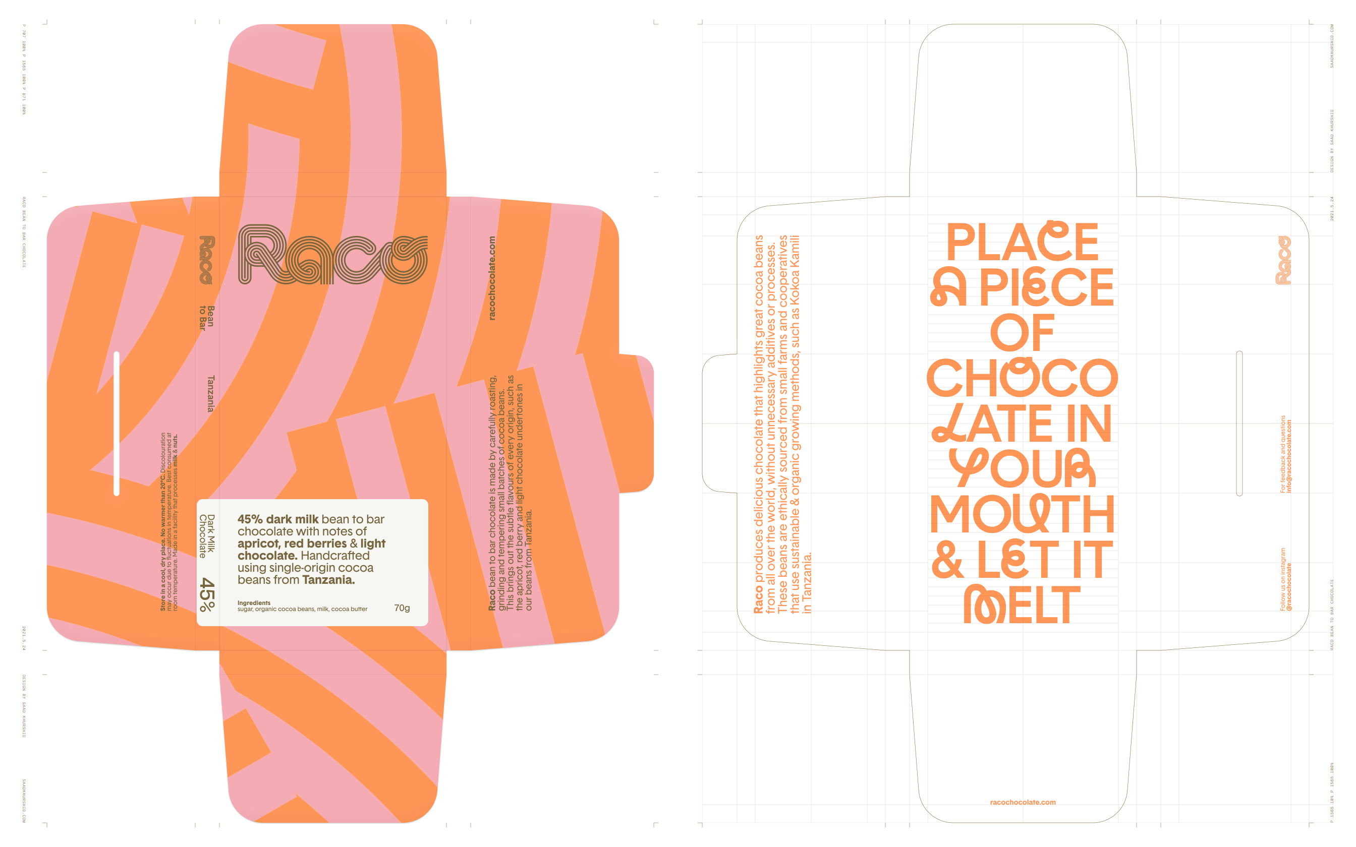
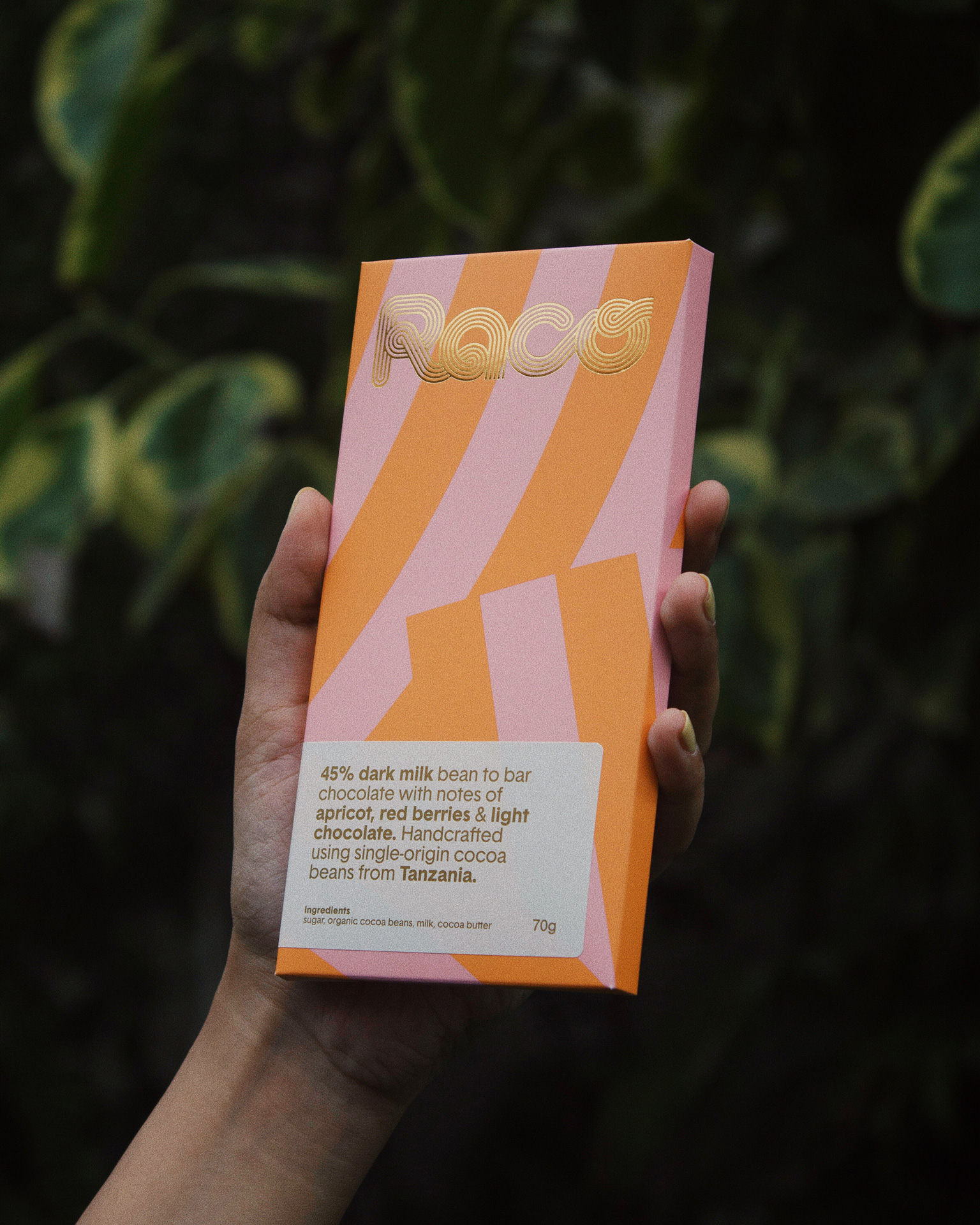
Raco Identity
Logotype for a bean to bar chocolate company in Karachi. The logo consists of strokes that combine the syllables: ‘Ra’ and ‘Co’. The strokes start off with a round cap and end with a butt (square) cap. The transformation of the circle into the square symbolises the ‘bean to bar’ process of the chocolate. |
|
|
|
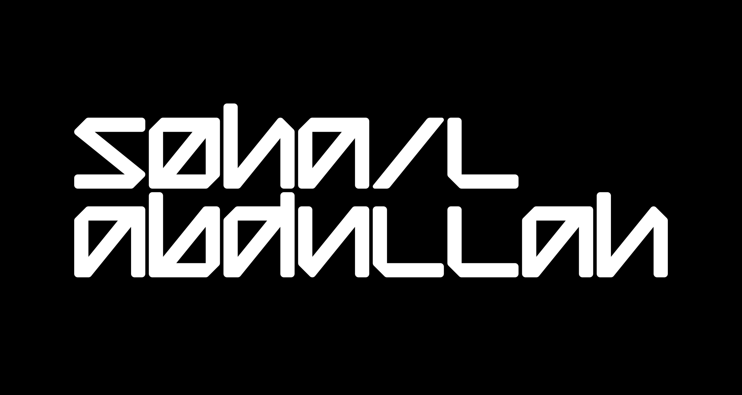
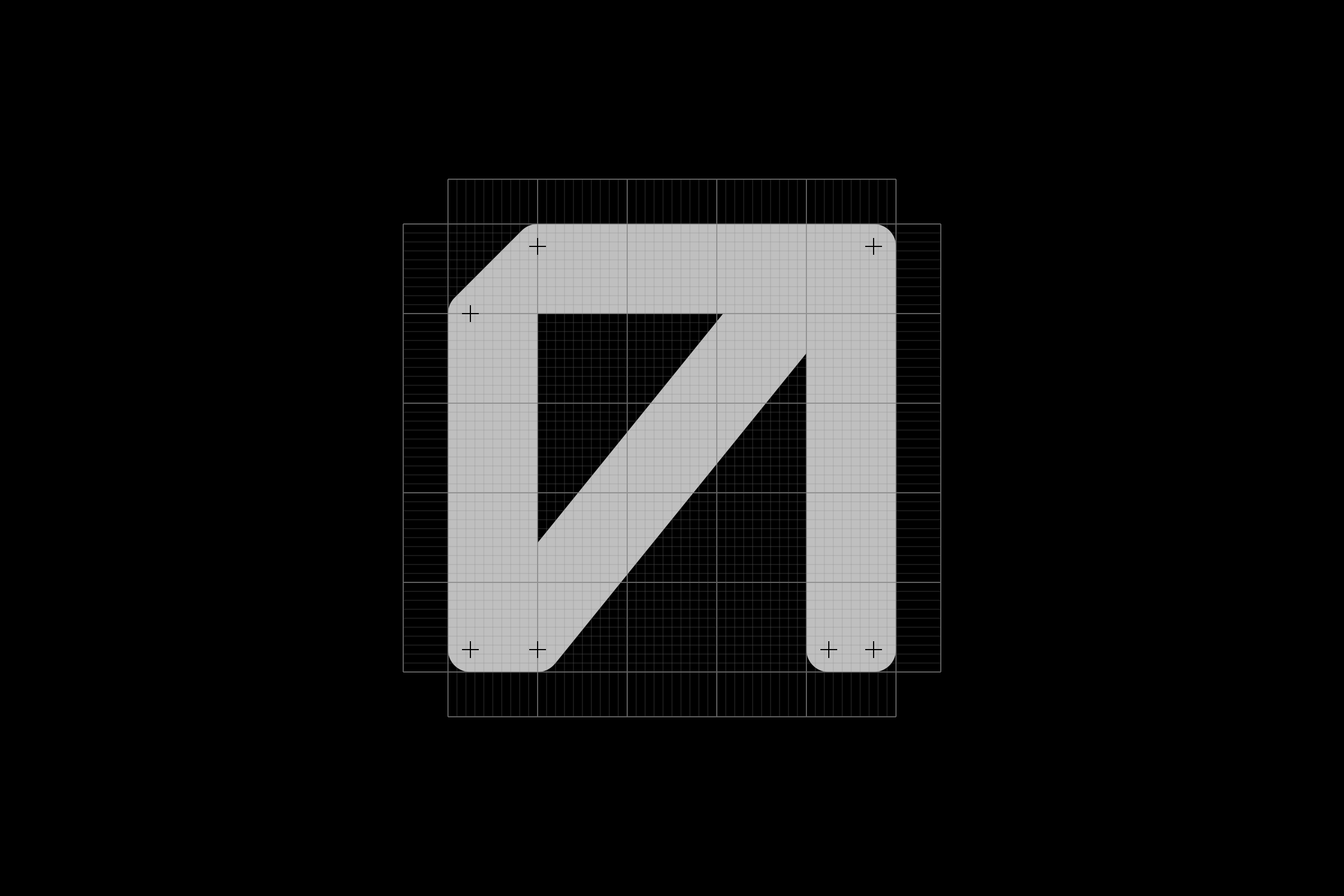
Sohail Abdullah Identity
Grid-based, modular typeface. Designed for the identity of the visual artist, Sohail Abdullah. The typeface was developed working closely with the artist. It takes inspiration From the artist's work, which is often consisting of large scale compositions made of intricate, geometric patterns. |
|
|
|
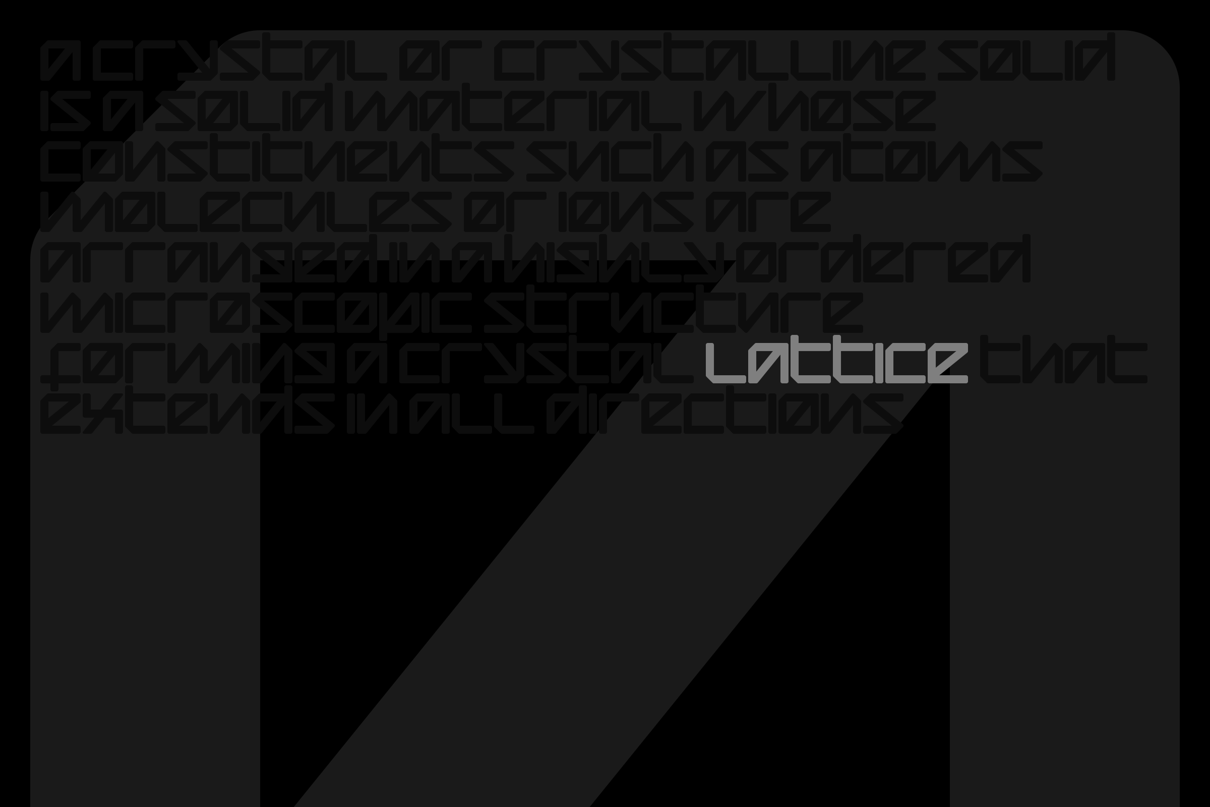
Lattice Typeface
Grid-based, modular typeface. Designed for the identity of the visual artist, Sohail Abdullah. The typeface was developed working closely with the artist. It takes inspiration From the artist's work, which is often consisting of large scale compositions made of intricate, geometric patterns. |
|
|
|
Kurachee Identity
A local platform that makes limited edition products with local Pakistani illustrators and designers. For the logotype, I made a custom typeface based on Frankfurter, but by only using geometric shapes. The identity attempts to emulate the spirit of local bazaars, which are very vibrant, noisy places, and where all sorts of people gather. The logotype is also formed of several odd looking pieces, that congregate to build the greater whole. Secondary elements— shapes that form the logo can be exploded and scattered like jelly beans, to create compositions that are colourful and chaotic, quite like the city of Karachi itself. |
|
|
|
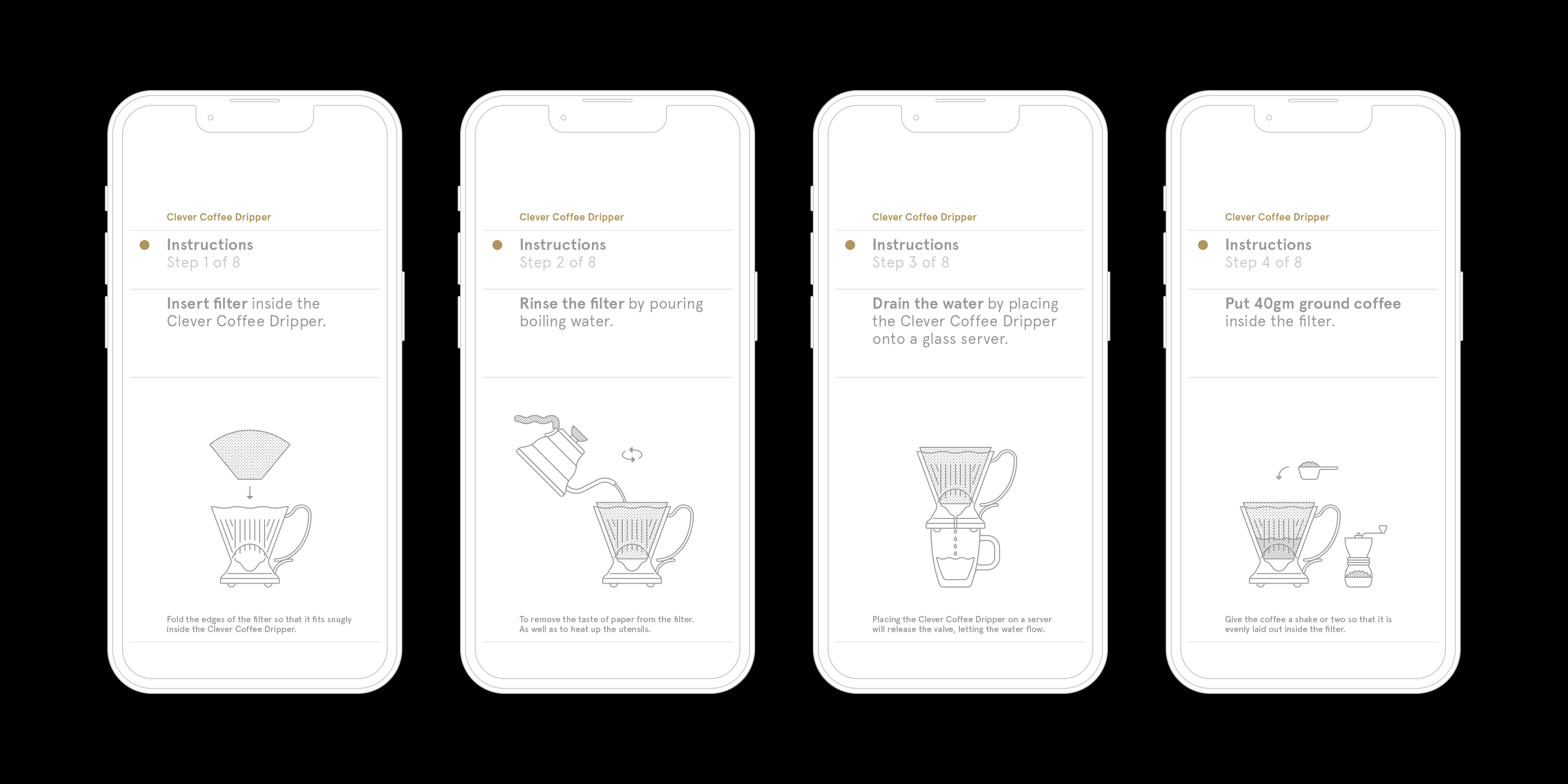
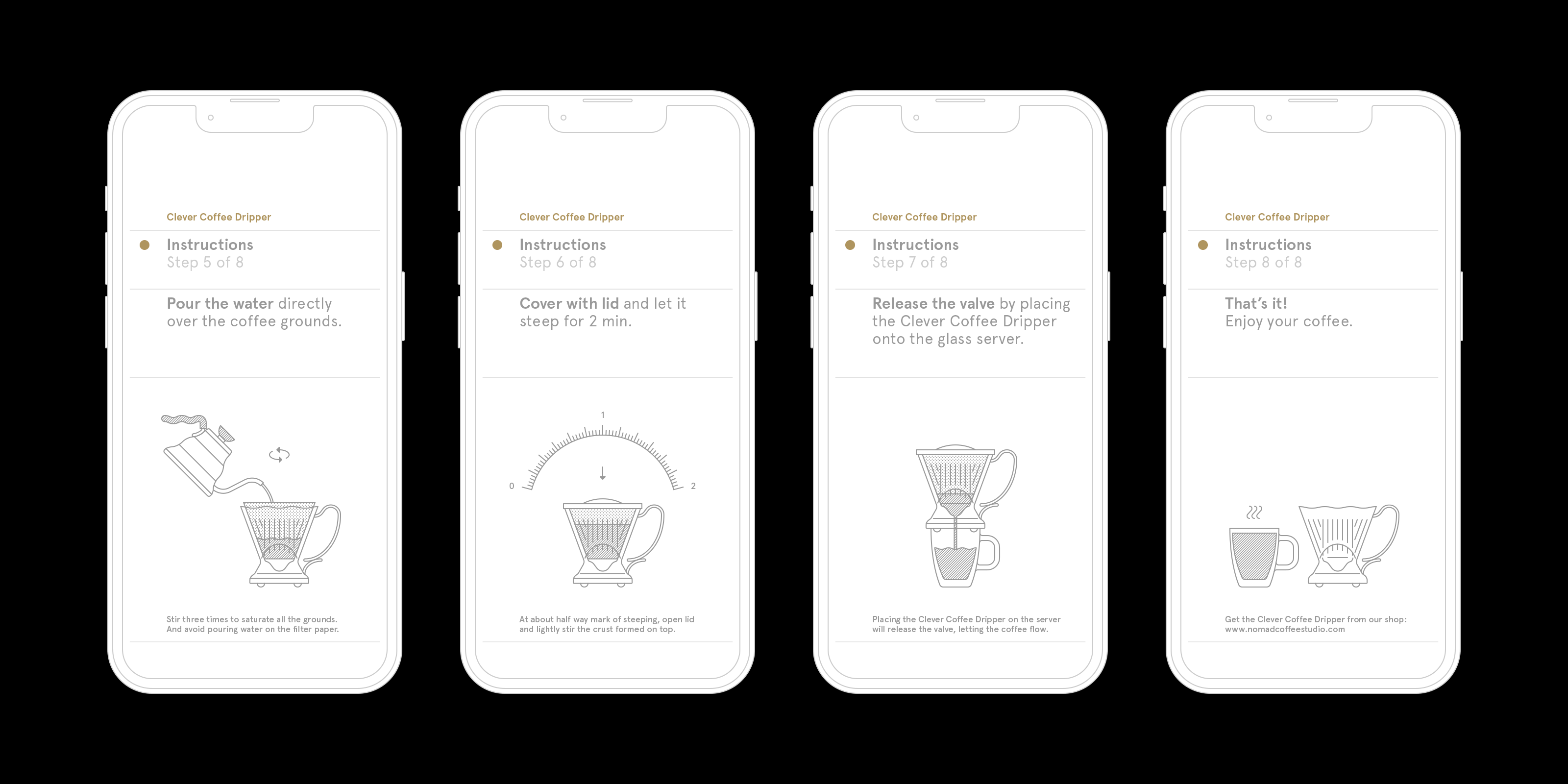
Clever Coffee Dripper Instructions
Layout and graphics for a set of step by step instructions on using the Clever Coffee Dripper. |
|
|
|
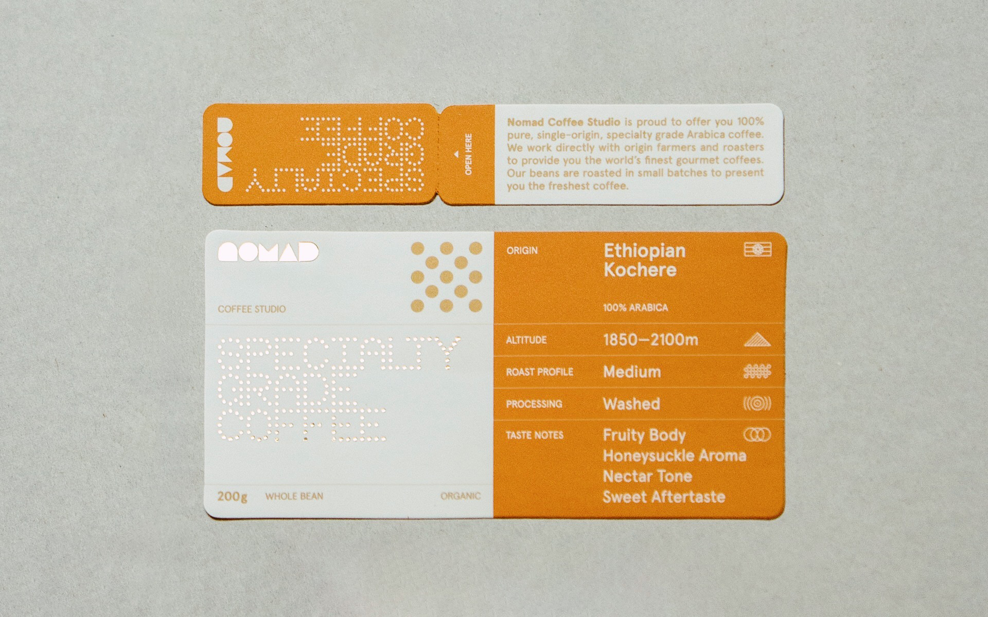
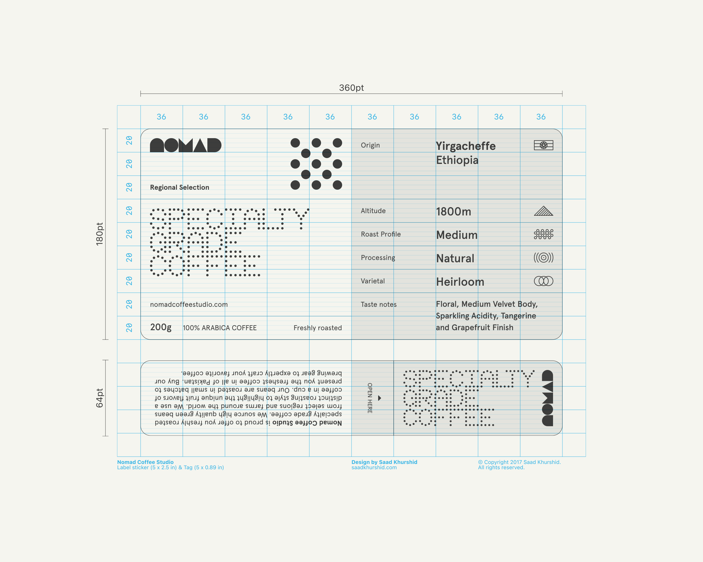
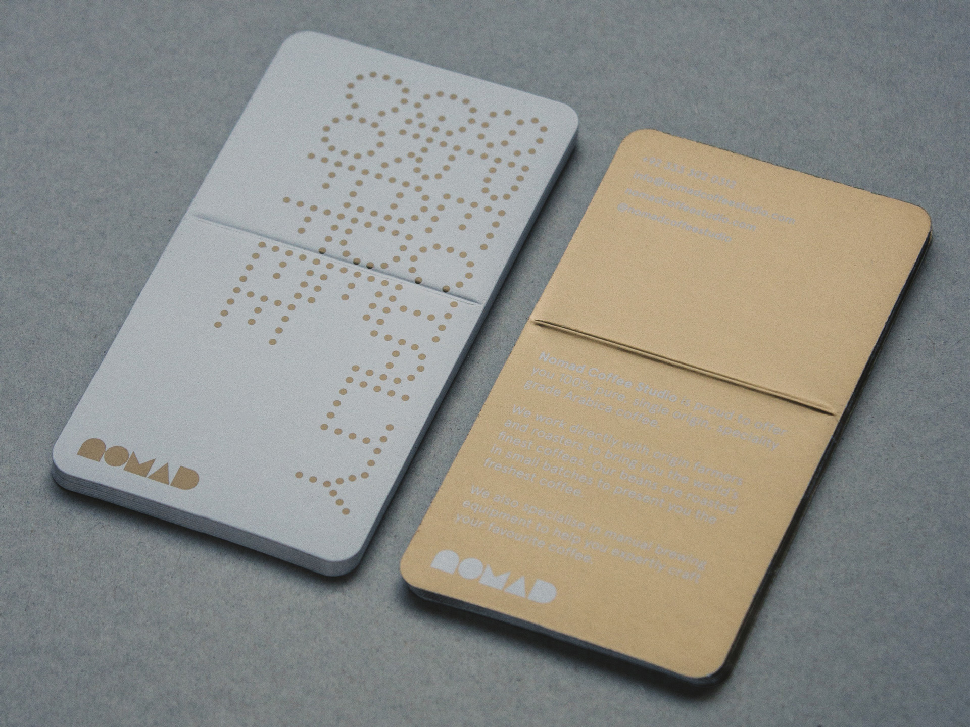
Coffee bag label
Sticker label for Nomad Coffee Studio's coffee bags. |
|
|
|
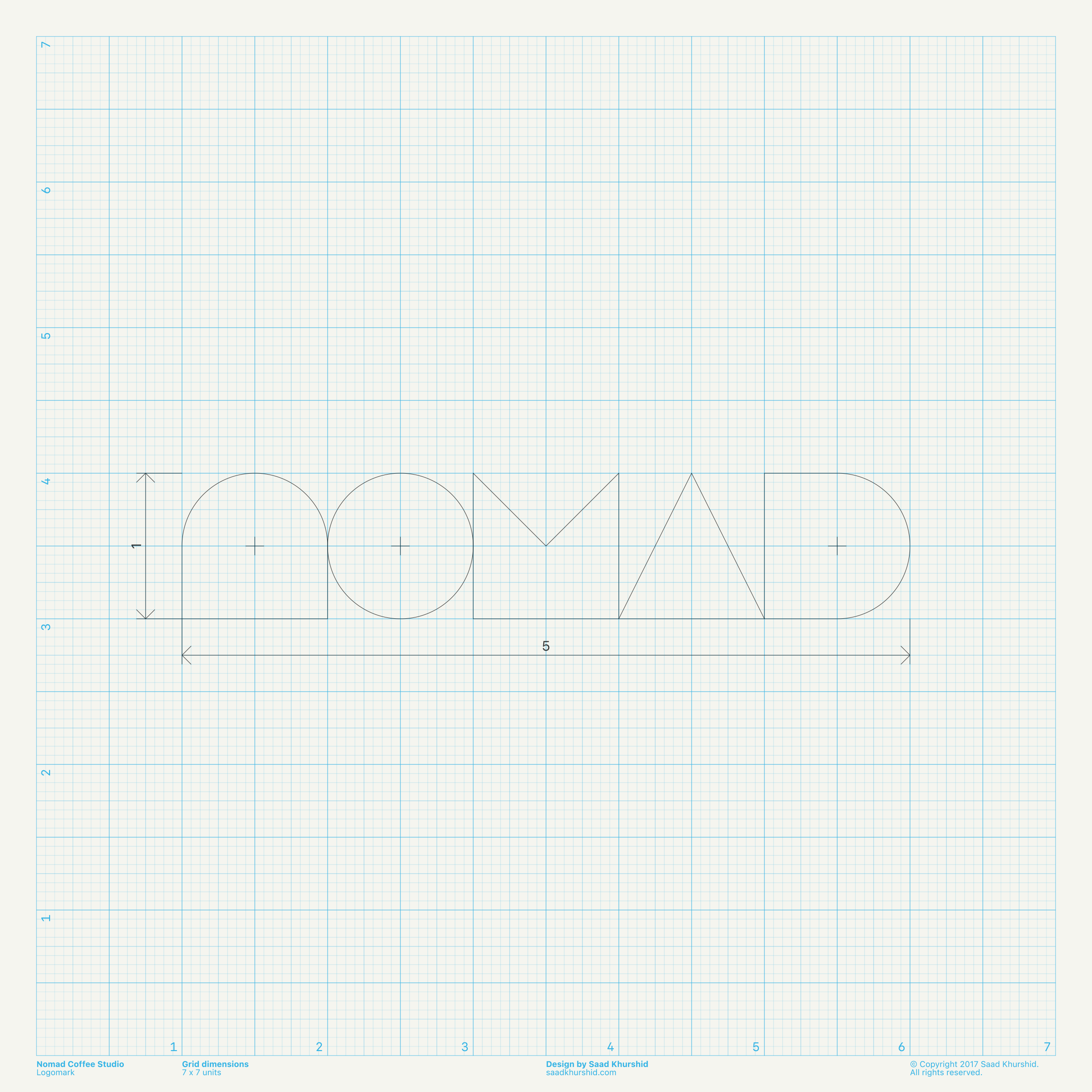
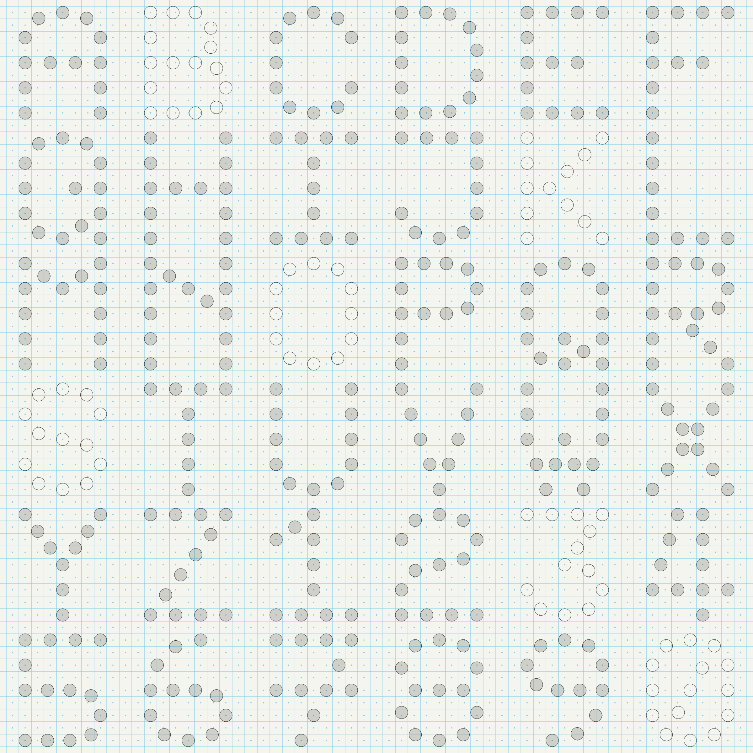
Nomad Coffee Studio Identity
Art direction, packaging, typeface design for a specialty coffee company in Karachi. |
|
|
|
|
Exhibition
Event
Date
Venue
City
Category
|
|
|
Post Reality
LDF: Lahore Digital Arts Festival
2021
Online exhibition
Lahore
Group exhibition
|
|
|
Metamorphosis
Red Bull Curates: Artist Residency
2018
The Valley Café
Karachi
Group exhibition
|
|
|
Jaanch Partaal Poster Exhibition
Vasl
2018
MAP
Karachi
Group exhibition
|
|
|
EST & UTC+5
Little Berlin
2018
Little Berlin
Philadelphia
Group exhibition
|
|
|
Rang Saazi
Lahore Music Meet
2017
Alhamra Arts Council
Lahore
Group exhibition
|
|
|
Secret Exhibition
RCA
2016
Alserkal Avenue
Dubai
Group exhibition
|
|
|
21 Cubic Feet
IAP
2012
IVS Images
Karachi
Group exhibition
|
|
|
Talk
Conference
Date
Venue
City
Category
|
|
|
A Number of Small Things
ND2C: National Design Conference
2019
Serena Hotel
Islamabad
Guest speaker
|
|
|
Visual Systems
Postervism: National Poster Design Competition
2018
Karachi University
Karachi
Guest speaker
|
|
|
Workshop
Event
Date
Venue
City
Category
|
|
|
Modular Typeface Design
ND2C: National Design Conference
2019
Serena Hotel
Islamabad
Instructor
|
|
|
Coptic-stitch Bookbinding
Type, Print & Bind
2018
British Council Library
Karachi
Instructor
|
|
|
Experimental Type Design
Type, Print & Bind
2017
Habib University
Karachi
Instructor
|
|
|
Publication
Article
Date
Publisher
City
Category
|
|
|
Vormator: The Elements of Design
Great Beards
2009
BIS
Amsterdam
Feature
|
|
|
Education
Degree
Date
School
City
Award
|
|
|
B. Des
Communication Design
2015
Indus Valley School of Art and Architecture
Karachi
Honours
|
|
|
Exchange semester
New Media Arts
2014
Kennesaw State University
Marietta
Honours
|